

Documentation
GridBagLayout
The grid bag layout manager places components in a grid of columns and rows, allowing specified components to span multiple columns or rows. Not all columns/rows necessarily have the same width/height. Essentially, GridBagLayout places components in rectangles (cells) in a grid, and then uses the components' preferred sizes to determine how big the cells should be.
Use the column and row headers to insert or delete columns/rows and change column/row properties.
GridBagLayout is part of the standard Java distribution. The API documentation is available here.
Extensions
JFormDesigner extends the original GridBagLayout with following features:
-
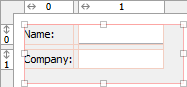
Horizontal and vertical gaps
Simply specify the gap size and JFormDesigner automatically computes theGridBagConstraints.insetsfor all components. This makes designing a form with consistent gaps using GridBagLayout much easier. No longer wrestling withGridBagConstraints.insets.With gaps: Without gaps: 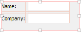
-
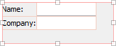
Left/top layout alignment
The pure GridBagLayout centers the layout within the container if there is enough space. JFormDesigner easily allows you to fix this problem by switching on two options: align left and align top.With layout alignment: Without layout alignment: 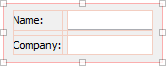
-
Default component alignment
Allows you to specify a default alignment for components within columns/rows. This is very useful for columns with right aligned labels because you specify the alignment only once for the column and all added labels will automatically aligned to the right.
Layout manager properties
A container with this layout manager has following layout manager properties:
| Property Name | Description | Default |
|---|---|---|
| horizontal gap | The horizontal gap between components. | 5 |
| vertical gap | The vertical gap between components. | 5 |
| align left | If true, aligns the layout to the left side of the container. If false, then the layout is centered horizontally. | true |
| align top | If true, aligns the layout to the top side of the container. If false, then the layout is centered vertically. | true |
These four properties are JFormDesigner extensions to the original GridBagLayout. However, no additional library is required.
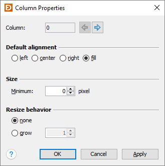
Column/row properties
Each column and row has its own properties. Use the column and row headers to change column/row properties.
 |
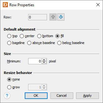 |
| Field | Description |
|---|---|
| Column/Row | The index of the column/row. Use the arrow buttons (or Alt+Left, Alt+Right, Alt+Up, Alt+Down keys) to edit the properties of the previous or next column/row. |
| Default alignment | The default alignment of the components within a column/row. Used if the value of the constraints properties "h align" or "v align" is DEFAULT. |
| Size | The minimum width of a column or height of a row. |
| Resize behavior | The resize weight of the column/row. |
Tip: The column/row context menu allows you to alter many of these options for multi-selections.
Layout constraints properties
A component contained in a container with this layout manager has following layout constraints properties:
| Property Name | Description | Default |
|---|---|---|
| grid x | Specifies the component's horizontal grid origin (column index). | 0 |
| grid y | Specifies the component's vertical grid origin (row index). | 0 |
| grid width | Specifies the component's horizontal grid extend (number of columns). | 1 |
| grid height | Specifies the component's vertical grid extend (number of rows). | 1 |
| h align | The horizontal alignment of the component within its cell. Possible values: DEFAULT, LEFT, CENTER, RIGHT and FILL. | DEFAULT |
| v align | The vertical alignment of the component within its cell. Possible values: DEFAULT, TOP, CENTER, BOTTOM, FILL, BASELINE, ABOVE_BASELINE and BELOW_BASELINE. | DEFAULT |
| weight x | Specifies how to distribute extra horizontal space. | 0.0 |
| weight y | Specifies how to distribute extra vertical space. | 0.0 |
| insets | Specifies the external padding of the component, the minimum amount of space between the component and the edges of its display area. | 0,0,0,0 |
| ipad x | Specifies the internal padding of the component, how much space to add to the minimum width of the component. | 0 |
| ipad y | Specifies the internal padding, that is, how much space to add to the minimum height of the component. | 0 |
In contrast to the GridBagConstraints API, which uses anchor and fill to
specify the alignment and resize behavior of a component, JFormDesigner uses the
usual h/v align notation.
Tip: The component context menu allows you to alter the alignment for multi-selections.