

Documentation
MigLayout
MigLayout is a superbly versatile and powerful layout manager. It is grid-based, but also supports docking and grouping.
Use the column and row headers to insert or delete columns/rows and change column/row properties.
Compared to other layout managers, MigLayout provides following outstanding features:
- Default alignment of components in a column/row.
- Specification of minimum and maximum column width or row height.
- Supports different units: LogicalPixel, Pixel, Point, Millimeter, Centimeter, Inch, Percent and ScreenPercent. Especially LogicalPixel units are very useful to create layouts that scale with the screen resolution.
- Gaps between columns, rows and components.
- Flexible Growing and Shrinking.
- Column/row grouping.
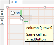
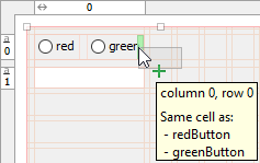
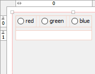
- In-cell Flow allows putting more than one component into a single grid cell.
- Docking Components to the edges of the container.
- Button Bars and Button Order.
- Override minimum, preferred and maximum component sizes.
- Visual Bounds improves/fixes layout (especially on macOS).
- Baseline support.
MigLayout is open source and not part of the standard Java distribution. You
must ship two additional libraries with your application. JFormDesigner includes
miglayout-swing.jar and miglayout-core.jar in its
redistributables. For more documentation and
tutorials, visit miglayout.com or
github.com/mikaelgrev/miglayout.
Maven Central Repository: groupId: com.miglayout artifactId:
miglayout-swing version: 11.2
The API documentation is available here: doc.formdev.com/miglayout-swing/ and doc.formdev.com/miglayout-core/.
IDE plug-ins: If you use MigLayout the first time, the JFormDesigner IDE plug-in ask you whether it should copy the required libraries (and its source code and documentation) to the IDE project and add it to the classpath of the IDE project.
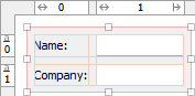
Insets
By default, all MigLayout containers have insets around the grid. This is
similar to setting an EmptyBorder on the container. You can change the insets
in the Layout manager properties.
| Default insets (panel): | Zero insets: | 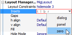 |
||
 |
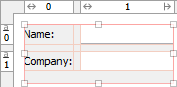 |
If you prefer zero insets by default, you can change the default layout constraints in the MigLayout preferences.
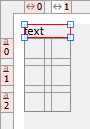
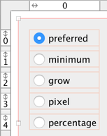
In-cell Flow
MigLayout allows you to place more than one component into a single grid cell. This is very useful for radio button groups and avoids nested containers.
 |
 |
 |
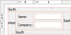
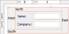
Docking Components
MigLayout supports docking components to its edges (similar to BorderLayout). You can dock more than one component to one edge. The center is laid out with a grid.
 |
 |
|
| Order: north, west, south, east | Order: east, south, west, north |
The docked components are laid out based on the component order. Earlier components get more space as you can see in the above screenshots. Use drag and drop in the Structure view to change order of docked components.
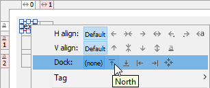
To dock a component, first place it somewhere in the grid, then right-click on the component and select one of the Dock items from the context menu.
 |
 |
Visual Bounds
Some component bounds are larger than their visual bounds (especially on macOS), which gives too large gaps on macOS but optimal gaps on other platforms. MigLayout solves this by considering visual padding when computing component sizes.
| Visual Padding on: | Visual Padding off: | |
 |
 |
Layout manager properties
A container with this layout manager has following layout manager properties:
| Property Name | Description | White Paper | Default |
|---|---|---|---|
| Layout Constraints | Comma separated list of layout constraints. This is a string representation of the options below. | Layout Constraints | |
| Insets | Specifies the insets for the container. Use this instead of an
EmptyBorder. |
insets | panel |
| Gaps | Specifies the default gaps between the columns/rows. | gap | related |
| h align | The horizontal alignment of the layout within its container. Possible values: Default, Left, Center, Right, Leading and Trailing. | alignx | Default |
| v align | The vertical alignment of the layout within its container. Possible values: Default, Top, Center and Bottom. | aligny | Default |
| Fill | Specifies whether columns and/or rows should claim all available space in the container. Possible values: (none), X, Y and Both. | fill | (none) |
| Hide Mode | Specifies how the layout manager handles invisible components. | hidemode | 0 |
| Flow Y | If true, multiple components in a single cell are lay out vertically. | flowy | false |
| right-to-left | If true, the columns are added from right-to-left. | righttoleft | false |
| bottom-to-top | If true, the rows are added from bottom-to-top. | bottomtotop | false |
| Visual Padding | If true, padding of visual bounds is considered when computing component sizes. | novisualpadding | true |
| Column Constraints | Constraints of all columns of the container. This property is for experts only. Use the column header instead of editing this property. | Column Constraints | |
| Row Constraints | Constraints of all rows of the container. This property is for experts only. Use the row header instead of editing this property. | Row Constraints |
Column/row properties
Each column and row has its own properties. Use the column and row headers to change column/row properties.
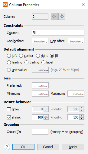
| Field | Description | White Paper |
|---|---|---|
| Column/Row | The index of the column/row. Use the arrow buttons (or Alt+Left, Alt+Right, Alt+Up, Alt+Down keys) to edit the properties of the previous or next column/row. | |
| Constraints | The column/row constraints. This is a string representation of the options below. | Column/Row Constraints |
| Gap before/after | The gaps before and after the column/row. | BoundSize |
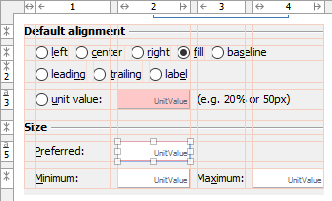
| Default alignment | The default alignment of the components within a column/row. Used if the value of the component constraint properties "h align" or "v align" are set to Default. | align, fill |
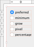
| Size | The width of a column or height of a row. You can specify preferred, minimum and a maximum sizes. | UnitValue, BoundSize |
| Resize behavior | The grow/shrink weight and priority of the column/row. | grow, growprio, shrink, shrinkprio |
| Grouping | See column/row grouping for details. | sizegroup |
Tip: The column/row context menu allows you to alter many of these options for multi-selections.
Layout constraints properties
A component contained in a container with this layout manager has following layout constraints properties:
| Property Name | Description | White Paper | Default |
|---|---|---|---|
| Layout Constraints | Comma separated component constraints. | Component Constraints | |
| Grid Bounds | The computed grid cell bounds (read-only). | ||
| Cell | The component's grid cell origin (column and row indices). | cell | 0,0 |
| Span | The component's grid cell extend (number of columns and rows). | span | 1,1 |
| h align | The horizontal alignment of the component within its cell. Possible values: Default, Left, Center, Right, Fill, Leading, Trailing and Label. | alignx | Default |
| v align | The vertical alignment of the component within its cell. Possible values: Default, Top, Center, Bottom, Fill and Baseline. | aligny | Default |
| Width | Overrides the component's minimum, preferred and maximum widths. | width, wmin, wmax | |
| Height | Overrides the component's minimum, preferred and maximum heights. | height, hmin, hmax | |
| Gaps | The gaps between the component and the cell edges. Increases cell size. | gap | 0,0,0,0 |
| Padding | The padding between the component and the cell edges. Does not increase cell size. | pad | 0,0,0,0 |
| Dock | Dock the component at an edge or the center of the container. Possible values: (none), North, South, West, East and Center. | dock | (none) |
| Tag | Tag used for platform dependent button ordering. Possible values: (none), ok, cancel, help, help2, yes, no, apply, next, back, finish, left, right and other. | tag | (none) |
Tip: The component context menu allows you to alter some constraints for multi-selections.