
Icons
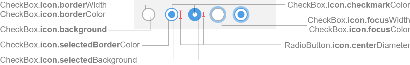
CheckBox Icon
Used for CheckBox. The icon is also the superclass of icon used for RadioButton.
Colors
| UI Key | Style Key v2 | Description |
|---|---|---|
| Enabled: | ||
| CheckBox.icon.borderColor | icon.borderColor | border color if not selected |
| CheckBox.icon.background | icon.background | background color if not selected |
| CheckBox.icon.selectedBorderColor | icon.selectedBorderColor | border color if selected |
| CheckBox.icon.selectedBackground | icon.selectedBackground | background color if selected |
| CheckBox.icon.checkmarkColor | icon.checkmarkColor | checkmark color |
| Disabled: | ||
| CheckBox.icon.disabledBorderColor | icon.disabledBorderColor | border color if disabled and not selected |
| CheckBox.icon.disabledBackground | icon.disabledBackground | background color if disabled and not selected |
| CheckBox.icon.disabledSelectedBorderColor v2 | icon.disabledSelectedBorderColor | border color if disabled and selected (optional; CheckBox.icon.disabledBorderColor is used if not specified) |
| CheckBox.icon.disabledSelectedBackground v2 | icon.disabledSelectedBackground | background color if disabled and selected (optional; CheckBox.icon.disabledBackground is used if not specified) |
| CheckBox.icon.disabledCheckmarkColor | icon.disabledCheckmarkColor | checkmark color if disabled |
| Hover: | ||
| CheckBox.icon.hoverBorderColor | icon.hoverBorderColor | border color if mouse is over component and not selected (optional) |
| CheckBox.icon.hoverBackground | icon.hoverBackground | background color if mouse is over component and not selected (optional) |
| CheckBox.icon.hoverSelectedBorderColor v2 | icon.hoverSelectedBorderColor | border color if mouse is over component and selected (optional; CheckBox.icon.hoverBorderColor is used if not specified) |
| CheckBox.icon.hoverSelectedBackground v2 | icon.hoverSelectedBackground | background color if mouse is over component and selected (optional; CheckBox.icon.hoverBackground is used if not specified) |
| CheckBox.icon.hoverCheckmarkColor v2 | icon.hoverCheckmarkColor | checkmark color if mouse is over component (optional; CheckBox.icon.checkmarkColor is used if not specified) |
| Pressed: | ||
| CheckBox.icon.pressedBorderColor v2 | icon.pressedBorderColor | border color if mouse is pressed on component and not selected (optional) |
| CheckBox.icon.pressedBackground | icon.pressedBackground | background color if mouse is pressed on component and not selected (optional) |
| CheckBox.icon.pressedSelectedBorderColor v2 | icon.pressedSelectedBorderColor | border color if mouse is pressed on component and selected (optional; CheckBox.icon.pressedBorderColor is used if not specified) |
| CheckBox.icon.pressedSelectedBackground v2 | icon.pressedSelectedBackground | background color if mouse is pressed on component and selected (optional; CheckBox.icon.pressedBackground is used if not specified) |
| CheckBox.icon.pressedCheckmarkColor v2 | icon.pressedCheckmarkColor | checkmark color if mouse is pressed on component (optional; CheckBox.icon.checkmarkColor is used if not specified) |
| Focused: | ||
| CheckBox.icon.focusedBorderColor | icon.focusedBorderColor | border color if focused and not selected (optional) |
| CheckBox.icon.focusedBackground | icon.focusedBackground | background color if focused and not selected (optional) |
| CheckBox.icon.focusedSelectedBorderColor v2 | icon.focusedSelectedBorderColor | border color if focused and selected (optional; CheckBox.icon.focusedBorderColor is used if not specified) |
| CheckBox.icon.focusedSelectedBackground v2 | icon.focusedSelectedBackground | background color if focused and selected (optional; CheckBox.icon.focusedBackground is used if not specified) |
| CheckBox.icon.focusedCheckmarkColor v2 | icon.focusedCheckmarkColor | checkmark color if focused (optional; CheckBox.icon.checkmarkColor is used if not specified) |
| CheckBox.icon.focusColor | icon.focusColor | outer focus border color (optional; defaults to Component.focusColor) |
Sizes
| UI Key | Style Key v2 | Type | Description |
|---|---|---|---|
| CheckBox.icon.borderWidth v2 | icon.borderWidth | int or float | line thickness used to paint the border if not selected (optional; defaults to Component.borderWidth) |
| CheckBox.icon.selectedBorderWidth v2 | icon.selectedBorderWidth | int or float | line thickness used to paint the border if selected (optional; defaults to CheckBox.icon.borderWidth) |
| CheckBox.icon.disabledSelectedBorderWidth v2 | icon.disabledSelectedBorderWidth | int or float | line thickness used to paint the border if disabled (optional; defaults to CheckBox.icon.selectedBorderWidth) |
| CheckBox.icon.focusWidth | icon.focusWidth | int or float | thickness of the outer focus border, or zero (optional; defaults to Component.focusWidth) |
| CheckBox.arc | icon.arc | int | arc diameter of the border corners |
Other
| UI Key | Style Key v2 | Type | Description |
|---|---|---|---|
| CheckBox.icon.style | - | String | style of check box icon: if filled, then UI keys prefixed with
CheckBox.icon[filled]. are used (if defined) |
RadioButton Icon
Used for RadioButton.
This icon extends CheckBox Icon and inherits all properties (except CheckBox.arc).
Sizes
| UI Key | Style Key v2 | Type | Description |
|---|---|---|---|
| RadioButton.icon.centerDiameter | icon.centerDiameter | int or float | diameter of the center circle |
Other
| UI Key | Style Key v2 | Type | Description |
|---|---|---|---|
| RadioButton.icon.style | - | String | style of radio button icon: if filled, then UI keys prefixed with
CheckBox.icon[filled]. are used (if defined) |
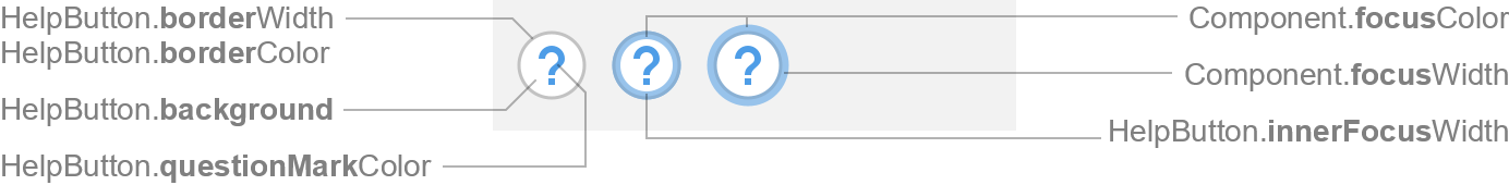
HelpButton Icon
Used for Button.
Colors
| UI Key | Style Key v2 | Description |
|---|---|---|
| Enabled: | ||
| HelpButton.borderColor | help.borderColor | border color |
| HelpButton.background | help.background | background color |
| HelpButton.questionMarkColor | help.questionMarkColor | question mark color |
| Disabled: | ||
| HelpButton.disabledBorderColor | help.disabledBorderColor | border color if disabled |
| HelpButton.disabledBackground | help.disabledBackground | background color if disabled |
| HelpButton.disabledQuestionMarkColor | help.disabledQuestionMarkColor | question mark color if disabled |
| Hover: | ||
| HelpButton.hoverBorderColor | help.hoverBorderColor | border color if mouse is over button (optional) |
| HelpButton.hoverBackground | help.hoverBackground | background color if mouse is over button (optional) |
| Pressed: | ||
| HelpButton.pressedBackground | help.pressedBackground | background color if mouse is pressed on button (optional) |
| Focused: | ||
| HelpButton.focusedBorderColor | help.focusedBorderColor | border color if focused |
| HelpButton.focusedBackground | help.focusedBackground | background color if focused (optional) |
| Component.focusColor | help.focusColor | outer focus border color |
Sizes
| UI Key | Style Key v2 | Type | Description |
|---|---|---|---|
| HelpButton.borderWidth | help.borderWidth | int | line thickness used to paint the border (optional; default is 1) |
| Component.focusWidth | help.focusWidth | int | thickness of the outer focus border, or zero |
| HelpButton.innerFocusWidth | help.innerFocusWidth | int or float | thickness of the inner focus border, or zero (optional; defaults to Component.innerFocusWidth) |
Menu Icons
Used for Menu, CheckBoxMenuItem and RadioButtonMenuItem.
Colors
| UI Key | Style Key v2 | Description |
|---|---|---|
| Menu.icon.arrowColor | icon.arrowColor | arrow color if enabled |
| Menu.icon.disabledArrowColor | icon.disabledArrowColor | arrow color if disabled |
| CheckBoxMenuItem.icon.checkmarkColor | icon.checkmarkColor | checkmark color if enabled |
| CheckBoxMenuItem.icon.disabledCheckmarkColor | icon.disabledCheckmarkColor | checkmark color if disabled |
Other
| UI Key | Style Key v2 | Type | Description |
|---|---|---|---|
| Component.arrowType | icon.arrowType | String | chevron (default) or triangle |