Slider
Swing component:
JSlider
Swing tutorial:
How to Use Sliders
Properties
Colors
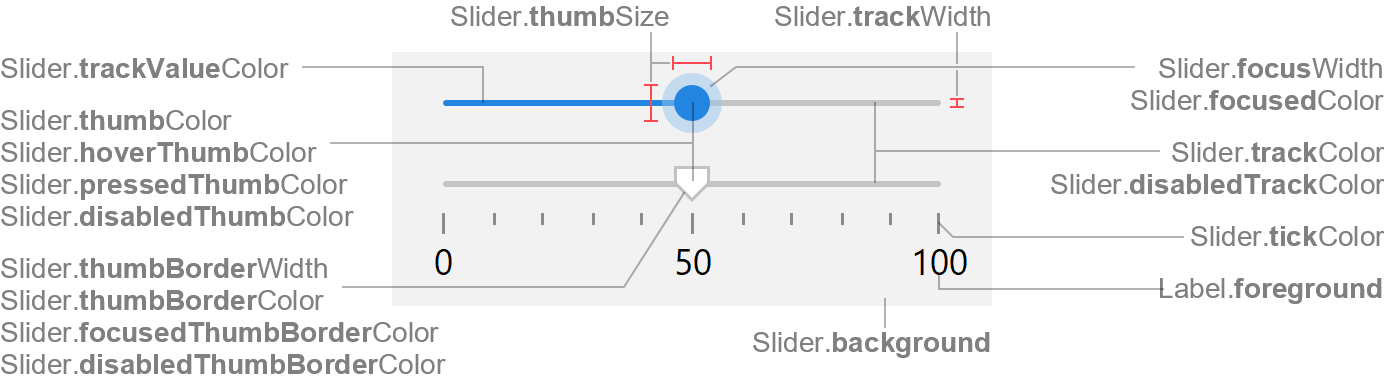
| UI Key |
Style Key v2 |
Description |
| Slider.trackColor |
trackColor |
track color |
| Slider.trackValueColor |
trackValueColor |
track value color (optional; defaults to Slider.thumbColor) |
| Slider.thumbColor |
thumbColor |
thumb color |
| Slider.hoverThumbColor |
hoverThumbColor |
thumb color if mouse is over thumb (optional) |
| Slider.pressedThumbColor |
pressedThumbColor |
thumb color if mouse is pressed on thumb (optional) |
| Slider.thumbBorderColor |
thumbBorderColor |
thumb border color (optional; if null, no border is painted) |
| Slider.focusedColor |
focusedColor |
thumb focus indicator color (optional; defaults to Component.focusColor) |
| Slider.focusedThumbBorderColor |
focusedThumbBorderColor |
thumb border color if focused (optional; defaults to
Component.focusedBorderColor) |
| Slider.disabledTrackColor |
disabledTrackColor |
track color if disabled |
| Slider.disabledThumbColor |
disabledThumbColor |
thumb color if disabled |
| Slider.disabledThumbBorderColor |
disabledThumbBorderColor |
thumb border color if disabled (optional; defaults to
Component.disabledBorderColor) |
| Slider.tickColor |
tickColor |
tick marks color |
| Slider.background |
background |
if slider is opaque, used to fill background |
| Slider.foreground |
foreground |
unused |
Sizes
| UI Key |
Style Key v2 |
Type |
Description |
| Slider.trackWidth |
trackWidth |
int |
thickness of the track |
| Slider.thumbSize |
thumbSize |
Dimension |
width and height of the thumb in horizontal orientation, rotated for
vertical orientation |
| Slider.thumbBorderWidth v2 |
thumbBorderWidth |
int or float |
thickness of the thumb border; if zero, no thumb border is painted |
| Slider.focusWidth |
focusWidth |
int |
thickness of the focus indicator painted around the thumb |
| Slider.horizontalSize |
- |
Dimension |
preferred width of horizontal sliders; height is ignored (computed
slider height is used) |
| Slider.verticalSize |
- |
Dimension |
preferred height of vertical sliders; width is ignored (computed slider
width is used) |
| Slider.minimumHorizontalSize |
- |
Dimension |
minimum width of horizontal sliders; height is ignored (computed slider
height is used) |
| Slider.minimumVerticalSize |
- |
Dimension |
minimum height of vertical sliders; width is ignored (computed slider
width is used) |
Other
| UI Key |
Style Key v2 |
Type |
Description |
| Slider.font |
font |
Font |
font used to render slider labels |
| Slider.border |
border |
Border |
usually null |
Styling v2
Following properties are Swing API, but are also available via styling. See
JSlider
API for details.
| Style Key |
Type |
Description |
Java API |
| minimum |
int |
minimum value of the slider |
setMinimum(int) |
| maximum |
int |
maximum value of the slider |
setMaximum(int) |
| value |
int |
value of the slider |
setValue(int) |
| majorTickSpacing |
int |
distance between major tick marks |
setMajorTickSpacing(int) |
| minorTickSpacing |
int |
distance between minor tick marks |
setMinorTickSpacing(int) |
| inverted |
boolean |
if true, the value-range shown is reversed |
setInverted(boolean) |
| paintLabels |
boolean |
if true, labels are painted |
setPaintLabels(boolean) |
| paintTicks |
boolean |
if true, tick marks are painted |
setPaintTicks(boolean) |
| paintTrack |
boolean |
if true, the track is painted |
setPaintTrack(boolean) |
| snapToTicks |
boolean |
if true, the thumb snaps to the closest tick mark |
setSnapToTicks(boolean) |
