
Table
Swing component:
JTable
Swing tutorial:
How to Use Tables
Properties
For table header properties see: TableHeader
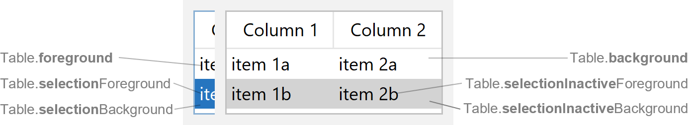
Colors
| UI Key | Style Key v2 | Description |
|---|---|---|
| Table.foreground | foreground | text color |
| Table.background | background | background color |
| Table.selectionForeground | selectionForeground | text color if selected and focused |
| Table.selectionBackground | selectionBackground | background color if selected and focused |
| Table.selectionInactiveForeground | selectionInactiveForeground | text color if selected but not focused |
| Table.selectionInactiveBackground | selectionInactiveBackground | background color if selected but not focused |
| Table.alternateRowColor | - | row background color used for odd rows |
| Table.gridColor | - | color of the grid (if grid is shown) |
| Table.cellFocusColor | cellFocusColor | cell focus indicator border color |
| Table.focusCellForeground | - | text color if cell is focused and editable but not selected |
| Table.focusCellBackground | - | background color if cell is focused and editable but not selected |
| Table.dropLineColor | - | color of line painted between two rows/columns while dragging rows/columns/cells |
| Table.dropLineShortColor | - | color of line painted between two cells while dragging rows/columns/cells |
| Table.dropCellForeground | - | text color if cell at mouse location is drop target while dragging rows/columns/cells |
| Table.dropCellBackground | - | background color if cell at mouse location is drop target while dragging rows/columns/cells |
Sizes
| UI Key | Style Key v2 | Type | Description |
|---|---|---|---|
| Table.rowHeight | rowHeight | int | height of each row |
| Table.cellMargins | cellMargins | Insets | space between cell bounds and cell text |
| Table.intercellSpacing | intercellSpacing | Dimension | space width between columns and space height between rows |
Other
| UI Key | Style Key v2 | Type | Description |
|---|---|---|---|
| Table.font | font | Font | font used to render text |
| Table.scrollPaneBorder | - | Border | border applied to containing scroll pane (optional) |
| Table.showHorizontalLines | showHorizontalLines | boolean | if true, show horizontal grid lines (Note: if used cell renderer
is opaque it is necessary to change Table.intercellSpacing as well) |
| Table.showVerticalLines | showVerticalLines | boolean | if true, show vertical grid lines (Note: if used cell renderer is
opaque it is necessary to change Table.intercellSpacing as well) |
| Table.showTrailingVerticalLine | showTrailingVerticalLine | boolean | if true, do not hide trailing vertical line of last column |
| Table.showCellFocusIndicator | showCellFocusIndicator | boolean | if
To avoid possible performance issues, checking for editable cells is limited to 50. If there are more cells to check, the focus indicator is always shown. |
| Table.cellNoFocusBorder | - | Border | cell border if cell is not focused |
| Table.focusCellHighlightBorder | - | Border | cell border if cell is focused but not selected |
| Table.focusSelectedCellHighlightBorder | - | Border | cell border if cell is selected and focused |
| Table.paintOutsideAlternateRows v2.3 | - | boolean | if true, paint alternating rows below table if table is smaller than scroll pane |
| Table.editorSelectAllOnStartEditing v3.4 | - | boolean | if true, select all text in cell editor when starting editing using F2 key |
| Table.consistentHomeEndKeyBehavior | - | boolean | if true, swap Home/End key bindings with Ctrl+Home/Ctrl+End
key bindings to make them consistent with List and Tree |
Styling v2
Following properties are Swing API, but are also available via styling. See JTable API for details.
| Style Key | Type | Description | Java API |
|---|---|---|---|
| fillsViewportHeight | boolean | if true, then the table is stretched to fill the height of an
enclosing viewport |
setFillsViewportHeight(boolean) |