
Tree
Swing component:
JTree
Swing tutorial:
How to Use Trees
Properties
Colors
| UI Key | Style Key v2 | Description |
|---|---|---|
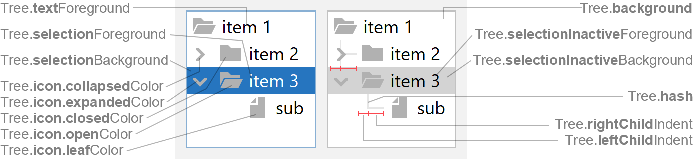
| Tree.foreground | foreground | unused (see Tree.textForeground) |
| Tree.background | background | background color |
| Tree.textForeground | - | text color |
| Tree.textBackground | - | cell background color if Tree.rendererFillBackground is enabled |
| Tree.selectionForeground | selectionForeground | text color if selected and focused |
| Tree.selectionBackground | selectionBackground | background color if selected and focused |
| Tree.selectionInactiveForeground | selectionInactiveForeground | text color if selected but not focused |
| Tree.selectionInactiveBackground | selectionInactiveBackground | background color if selected but not focused |
| Tree.hash | - | line color used if Tree.paintLines is enabled |
| Tree.selectionBorderColor | selectionBorderColor | focus indicator border color |
| Tree.editorBorderSelectionColor | - | color of border painted around editor container when editing cell (optional) |
| Tree.dropLineColor | - | color of line painted between two cells while dragging cells |
| Tree.dropCellForeground | - | text color if cell at mouse location is drop target while dragging cells |
| Tree.dropCellBackground | - | background color if cell at mouse location is drop target while dragging cells |
| Tree.icon.expandedColor | icon.expandedColor | color of "expanded" arrow icon |
| Tree.icon.collapsedColor | icon.collapsedColor | color of "collapsed" arrow icon |
| Tree.icon.leafColor | icon.leafColor | color of "leaf" icon |
| Tree.icon.closedColor | icon.closedColor | color of "closed" icon |
| Tree.icon.openColor | icon.openColor | color of "open" icon |
Sizes
| UI Key | Style Key v2 | Type | Description |
|---|---|---|---|
| Tree.rowHeight | rowHeight | int | height of each row; if zero, then the height of each row is determined by the renderer |
| Tree.rendererMargins | - | Insets | space between cell bounds and cell text |
| Tree.leftChildIndent | - | int | distance between left margin and where vertical dashes (Tree.paintLines) will be drawn (the total child indent is the sum of left and right child indent) |
| Tree.rightChildIndent | - | int | distance to add to Tree.leftChildIndent to determine where cell contents will be drawn (the total child indent is the sum of left and right child indent) |
| Tree.selectionInsets v3 | selectionInsets | Insets | space between cell bounds and cell selection |
| Tree.selectionArc v3 | selectionArc | int | arc diameter of the selection corners |
Other
| UI Key | Style Key v2 | Type | Description |
|---|---|---|---|
| Tree.font | font | Font | font used to render text |
| Tree.border | border | Border | usually a FlatEmptyBorder |
| Tree.wideSelection | wideSelection | boolean | if true, paint wide selection across the whole tree width |
| Tree.showDefaultIcons v3 | showDefaultIcons | boolean | if true, paint default closed/opened/leaf icons on all rows |
| Tree.paintLines | - | boolean | if true, paints lines that connect cells and indicate hierarchy |
| Tree.lineTypeDashed | - | boolean | if true, paint dashed lines (instead of solid lines) |
| Tree.showsRootHandles | showsRootHandles | boolean | if true, show the expand/collapse handles of root nodes |
| Tree.showCellFocusIndicator | showCellFocusIndicator | boolean | if true, shows the cell focus indicator border (but only if multiple
cells are selected) |
| Tree.drawsFocusBorderAroundIcon | - | boolean | if true, paint cell focus indicator border around icon as well |
| Tree.drawDashedFocusIndicator | - | boolean | if true, paint cell focus indicator border with dashed lines (instead
of solid lines) |
| Tree.rendererFillBackground | - | boolean | if true, fill cell background with Tree.textBackground color |
| Tree.repaintWholeRow | - | boolean | if true, repaint whole width of rows |
| Tree.editorBorder | - | Border | text field border used for editing cell |
| Tree.scrollsOnExpand | scrollsOnExpand | boolean | if true, scroll vertically when expanding a node to make the maximum
number of node's descendants visible |
| Tree.scrollsHorizontallyAndVertically | - | boolean | if true, when navigating scroll horizontally to make whole node
visible |
| Component.arrowType | arrowType | String | arrow type of expanded/collapsed icons: chevron (default) or
triangle |
| Tree.expandedIcon | - | Icon | arrow icon used to indicate that node is expanded |
| Tree.collapsedIcon | - | Icon | arrow icon used to indicate that node is collapsed |
| Tree.leafIcon | - | Icon | icon used for leaf nodes |
| Tree.closedIcon | - | Icon | icon used for non-leaf nodes that are collapsed |
| Tree.openIcon | - | Icon | icon used for non-leaf nodes that are expanded |
Styling v2
Following properties are only available via styling (not in UI defaults, but has likewise client properties).
| Style Key | Type | Description | Client Property |
|---|---|---|---|
| paintSelection | boolean | if false, the cell renderer is responsible for painting selection |
JTree.paintSelection |
Following properties are Swing API, but are also available via styling. See JTree API for details.
| Style Key | Type | Description | Java API |
|---|---|---|---|
| rootVisible | boolean | if true, the root is visible |
setRootVisible(boolean) |
| visibleRowCount | int | number of visible rows; used to calculate preferred size | setVisibleRowCount(int) |