
Customizing
You can customize the appearance of FlatLaf to some degree by setting UI defaults either in Java with:
UIManager.put( "someKey", someValue );
Or in FlatLaf properties files with:
someKey = someValue
See How to Customize for more details.
This page describes only some of the available settings. More can be found here.
General
Rounded or Square Corners
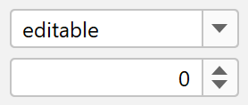
Buttons, toggle buttons, combo boxes and spinners use rounded corners by default. If you prefer square corners use:
UIManager.put( "Button.arc", 0 );
UIManager.put( "Component.arc", 0 );
UIManager.put( "CheckBox.arc", 0 );
UIManager.put( "ProgressBar.arc", 0 );
Button.arc = 0
Component.arc = 0
CheckBox.arc = 0
ProgressBar.arc = 0
Button.arc is the corner arc diameter for buttons and toggle buttons (default
is 6), Component.arc is used for other components like combo boxes and
spinners (default is 5), CheckBox.arc is used for check box icon (default is
4) and ProgressBar.arc is used for progress bars (default is 4).
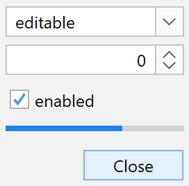
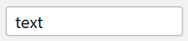
Text fields use square corners by default. If you prefer rounded corners use:
UIManager.put( "TextComponent.arc", 5 );
TextComponent.arc = 5
Round components
Use large values for arc to get "round" components:
UIManager.put( "Button.arc", 999 );
UIManager.put( "Component.arc", 999 );
UIManager.put( "ProgressBar.arc", 999 );
UIManager.put( "TextComponent.arc", 999 );
Button.arc = 999
Component.arc = 999
ProgressBar.arc = 999
TextComponent.arc = 999
You can enable round corners also on individual components with:
myButton.putClientProperty( "JButton.buttonType", "roundRect" );
myComboBox.putClientProperty( "JComponent.roundRect", true );
mySpinner.putClientProperty( "JComponent.roundRect", true );
myTextField.putClientProperty( "JComponent.roundRect", true );
Arrow Type
chevron
triangle
Some components (e.g. combo boxes, spinner, tree, etc) use arrows. FlatLaf supports two types of arrows: chevron and triangle.
To change the arrow type for all arrows in FlatLaf use:
UIManager.put( "Component.arrowType", "chevron" );
or
UIManager.put( "Component.arrowType", "triangle" );
Component.arrowType = chevron
or
Component.arrowType = triangle
Outer focus border width
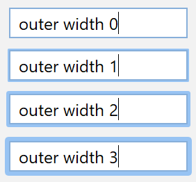
Most focusable components in FlatLaf (e.g. button, combo boxes, text fields,
etc) indicate the focused state with special borders. The FlatLaf Light and
FlatLaf Dark themes use a different color on the existing border (outer
focus width is 0). On the other hand the FlatLaf IntelliJ and FlatLaf
Darcula themes use outer borders of width 2, which are painted outside of
the component.
You can control the width of the outer focus border in all themes with:
UIManager.put( "Component.focusWidth", 1 );
Component.focusWidth = 1
Note: Using outer focus border increases the size of components.
Inner focus border width
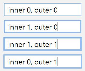
In addition to the outer focus border, FlatLaf also supports inner focus borders, which do not increase the size of components.
You can change the inner focus width using:
UIManager.put( "Component.innerFocusWidth", 1 );
UIManager.put( "Button.innerFocusWidth", 1 );
Component.innerFocusWidth = 1
Button.innerFocusWidth = 1
Show Mnemonics
Mnemonics are hidden by default and made visible when Alt key is pressed. To make mnemonics always visible use:
UIManager.put( "Component.hideMnemonics", false );
Component.hideMnemonics = false
Scroll Bar
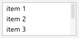
Show Buttons
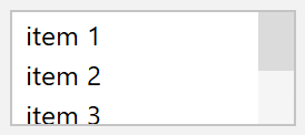
The previous/next arrow buttons of scroll bars are hidden by default. To make them visible for all scroll bars in your application use:
UIManager.put( "ScrollBar.showButtons", true );
ScrollBar.showButtons = true
Or enable them on single components (JScrollPane or JScrollBar) with:
myScrollPane.putClientProperty( "JScrollBar.showButtons", true );
or
myScrollBar.putClientProperty( "JScrollBar.showButtons", true );
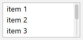
Width
The default width of scroll bars is 10. To make them wider (or smaller) use:
UIManager.put( "ScrollBar.width", 16 );
ScrollBar.width = 16
Style
Thumb insets add empty space around the thumb:
UIManager.put( "ScrollBar.thumbInsets", new Insets( 2, 2, 2, 2 ) );
ScrollBar.thumbInsets = 2,2,2,2
Track insets add empty space around the track:

UIManager.put( "ScrollBar.trackInsets", new Insets( 2, 4, 2, 4 ) );
UIManager.put( "ScrollBar.thumbInsets", new Insets( 2, 2, 2, 2 ) );
UIManager.put( "ScrollBar.track", new Color( 0xe0e0e0 ) );
ScrollBar.trackInsets = 2,4,2,4
ScrollBar.thumbInsets = 2,2,2,2
ScrollBar.track = #e0e0e0
Note: Track and thumb insets must be specified for vertical scroll bars. They are rotated for horizontal scroll bars.
Thumb can be rounded:

UIManager.put( "ScrollBar.thumbArc", 3 );
UIManager.put( "ScrollBar.thumbInsets", new Insets( 2, 2, 2, 2 ) );
ScrollBar.thumbArc = 3
ScrollBar.thumbInsets = 2,2,2,2
Or round:

UIManager.put( "ScrollBar.thumbArc", 999 );
UIManager.put( "ScrollBar.thumbInsets", new Insets( 2, 2, 2, 2 ) );
ScrollBar.thumbArc = 999
ScrollBar.thumbInsets = 2,2,2,2
Track can be also round:
UIManager.put( "ScrollBar.trackArc", 999 );
UIManager.put( "ScrollBar.thumbArc", 999 );
UIManager.put( "ScrollBar.trackInsets", new Insets( 2, 4, 2, 4 ) );
UIManager.put( "ScrollBar.thumbInsets", new Insets( 2, 2, 2, 2 ) );
UIManager.put( "ScrollBar.track", new Color( 0xe0e0e0 ) );
ScrollBar.trackArc = 999
ScrollBar.thumbArc = 999
ScrollBar.trackInsets = 2,4,2,4
ScrollBar.thumbInsets = 2,2,2,2
ScrollBar.track = #e0e0e0
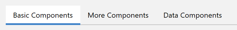
Tabbed Pane
Tab Separators
Separator lines can be shown between tabs:

UIManager.put( "TabbedPane.showTabSeparators", true );
TabbedPane.showTabSeparators = true
Separator lines can take full height if you prefer this look:
UIManager.put( "TabbedPane.tabSeparatorsFullHeight", true );
TabbedPane.tabSeparatorsFullHeight = true
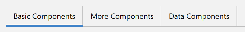
Selected Tab Background
To make the selected tab stand out, change the selected tab background:
UIManager.put( "TabbedPane.selectedBackground", Color.white );
TabbedPane.selectedBackground = #fff