
Borders
FlatBorder
Used for ScrollPane. The border is also the superclass of other borders used for Button, ComboBox, Spinner, TextField, FormattedTextField and PasswordField.
Colors
| UI Key | Style Key since v2 | Description |
|---|---|---|
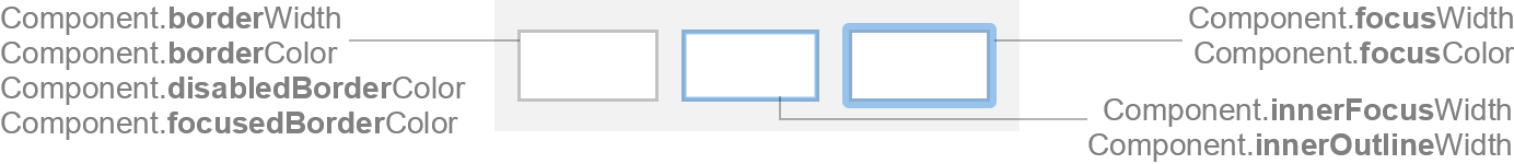
| Component.borderColor | borderColor | border color if component is enabled and not focused |
| Component.disabledBorderColor | disabledBorderColor | border color if component is disabled |
| Component.focusedBorderColor | focusedBorderColor | border color if component is focused |
| Component.focusColor | focusColor | outer focus border color |
| Component.error.borderColor | error.borderColor | border color used if client property JComponent.outline or style
outline are set to error |
| Component.error.focusedBorderColor | error.focusedBorderColor | border color used if component is focused and client property
JComponent.outline or style outline are set to error |
| Component.warning.borderColor | warning.borderColor | border color used if client property JComponent.outline or style
outline are set to warning |
| Component.warning.focusedBorderColor | warning.focusedBorderColor | border color used if component is focused and client property
JComponent.outline or style outline are set to warning |
| Component.custom.borderColor | custom.borderColor | color function used to derive a color for unfocused state if client
property JComponent.outline is set to a java.awt.Color, or if style
outlineFocusedColor is set |
Sizes
| UI Key | Style Key since v2 | Type | Description |
|---|---|---|---|
| Component.borderWidth since v2 | borderWidth | int or float | line thickness used to paint the border |
| Component.focusWidth | focusWidth | int | thickness of the outer focus border, or zero |
| Component.innerFocusWidth | innerFocusWidth | int or float | thickness of the inner focus border, or zero |
| Component.innerOutlineWidth | innerOutlineWidth | int or float | used instead of Component.innerFocusWidth if an outline color is set
on the component (via client property or styling) |
Styling since v2
Following properties are only available via styling (not in UI defaults, but has likewise client properties).
| Style Key | Type | Description | Client Property |
|---|---|---|---|
| outline | String | if error, uses reddish border color to indicate an error; if
warning, uses yellowish border color to indicate a warning |
JComponent.outline |
| outlineColor | Color | border color used if component, if style outlineFocusedColor is not
set then it is derived from this color |
JComponent.outline |
| outlineFocusedColor | Color | border color used if component is focused; if style outlineColor is
not set then it is derived from this color |
JComponent.outline |
FlatButtonBorder
Used for Button and ToggleButton.

Colors
| UI Key | Style Key since v2 | Description |
|---|---|---|
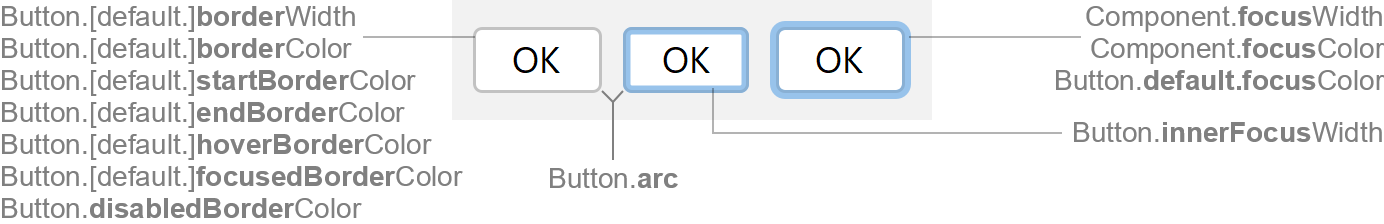
| Button.borderColor | borderColor | button border color if enabled |
| Button.startBorderColor | - | if set, a gradient paint is used and Button.borderColor is ignored (optional) |
| Button.endBorderColor | - | if set, a gradient paint is used (optional) |
| Button.disabledBorderColor | disabledBorderColor | button border color if disabled |
| Button.hoverBorderColor | hoverBorderColor | button border color if mouse is over button (optional) |
| Button.pressedBorderColor since v3.5 | pressedBorderColor | button border color if mouse is pressed on button (optional) |
| Button.focusedBorderColor | focusedBorderColor | button border color if focused |
Selected Button (if AbstractButton.isSelected() is true) |
||
| Button.selectedBorderColor since v3.5 | selectedBorderColor | button border color if selected and enabled (optional) |
| Button.disabledSelectedBorderColor since v3.5 | disabledSelectedBorderColor | button border color if selected and disabled (optional) |
| Button.hoverSelectedBorderColor since v3.5 | hoverSelectedBorderColor | button border color if selected and mouse is over button (optional) |
| Button.pressedSelectedBorderColor since v3.5 | pressedSelectedBorderColor | button border color if selected and mouse is pressed on button (optional) |
| Button.focusedSelectedBorderColor since v3.5 | focusedSelectedBorderColor | button border color if selected and focused (optional) |
Default Button (if JButton.isDefaultButton() is true) |
||
| Button.default.borderColor | default.borderColor | default button border color if enabled |
| Button.default.startBorderColor | - | if set, a gradient paint is used and Button.default.borderColor is ignored (optional) |
| Button.default.endBorderColor | - | if set, a gradient paint is used (optional) |
| Button.default.hoverBorderColor | default.hoverBorderColor | default button border color if mouse is over button (optional) |
| Button.default.pressedBorderColor since v3.5 | defaultPressedBorderColor | default button border color if mouse is pressed on button (optional) |
| Button.default.focusedBorderColor | default.focusedBorderColor | default button border color if focused |
| Button.default.focusColor | default.focusColor | default button outer focus border color |
ToolBar Button (if button is child of JToolBar) |
||
| Button.toolbar.focusColor | toolbar.focusColor | toolbar button focus border color (optional; defaults to Component.focusColor) |
Sizes
| UI Key | Style Key since v2 | Type | Description |
|---|---|---|---|
| Button.borderWidth | borderWidth | int or float | line thickness used to paint the button border (optional; defaults to Component.borderWidth) |
| Button.default.borderWidth | default.borderWidth | int or float | line thickness used to paint the default button border |
| Component.focusWidth | focusWidth | int | thickness of the outer focus border, or zero |
| Button.innerFocusWidth | innerFocusWidth | int or float | thickness of the inner focus button border, or zero (optional; defaults to Component.innerFocusWidth) |
| Button.arc | arc | int | arc diameter of the button border corners |
| Button.toolbar.focusWidth | toolbar.focusWidth | int or float | toolbar button focus border thickness |
| Button.toolbar.spacingInsets | toolbar.spacingInsets | Insets | spacing insets between the toolbar button component bounds and the visible bounds |
| Button.toolbar.margin | toolbar.margin | Insets | margin space between the visible toolbar button bounds and the button icon/text |
FlatRoundBorder
Used for ComboBox and Spinner.
This border extends FlatBorder and inherits all properties.
Sizes
| UI Key | Style Key since v2 | Type | Description |
|---|---|---|---|
| Component.arc | arc | int | arc diameter of the border corners |
FlatScrollPaneBorder
Used for ScrollPane.
This border extends FlatBorder and inherits all properties.
Sizes
| UI Key | Style Key since v2 | Type | Description |
|---|---|---|---|
| ScrollPane.arc since v3.3 | arc | int | arc diameter of the border corners |
| ScrollPane.List.arc since v3.3 | - | int | arc diameter of the border corners if scroll view is a
List (optional; defaults to ScrollPane.arc if
value is -1) |
| ScrollPane.Table.arc since v3.3 | - | int | arc diameter of the border corners if scroll view is a
Table (optional; defaults to ScrollPane.arc if
value is -1) |
| ScrollPane.TextComponent.arc since v3.3 | - | int | arc diameter of the border corners if scroll view is a
TextArea, TextPane and EditorPane (optional;
defaults to ScrollPane.arc if value is -1) |
| ScrollPane.Tree.arc since v3.3 | - | int | arc diameter of the border corners if scroll view is a
Tree (optional; defaults to ScrollPane.arc if
value is -1) |
FlatTextBorder
Used for TextField, FormattedTextField and PasswordField.
This border extends FlatBorder and inherits all properties.
Sizes
| UI Key | Style Key since v2 | Type | Description |
|---|---|---|---|
| TextComponent.arc | arc | int | arc diameter of the border corners |