
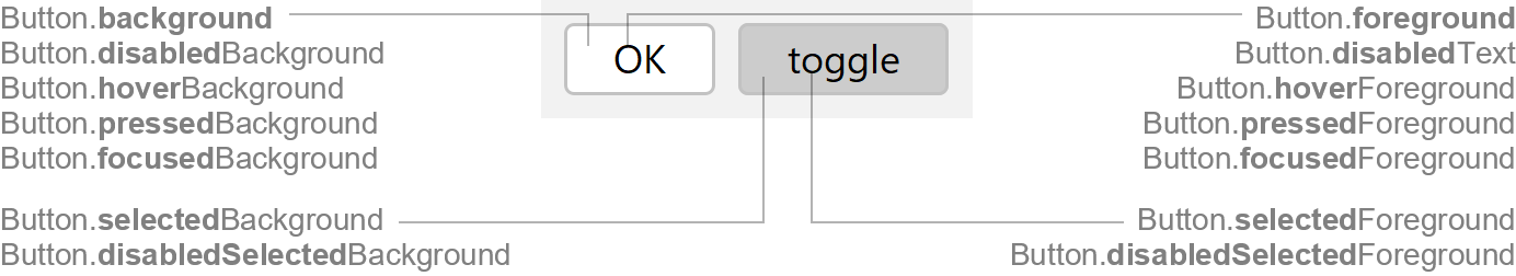
Button and ToggleButton
Swing components:
JButton and
JToggleButton
Swing tutorial:
How to Use Buttons
Following documentation describes Button, but ToggleButton has (nearly) same
properties. For properties marked with T , replace Button. with
ToggleButton..
Properties
For border properties see: FlatButtonBorder
Colors
| UI Key | Style Key v2 | Description |
|---|---|---|
| Button.foreground (T) | foreground | text color if enabled |
| Button.disabledText (T) | disabledText | text color if disabled |
| Button.background (T) | background | background color if enabled |
| Button.startBackground (T) | - | start color used for linear gradient background (optional; only used if Button.endBackground is also set; Button.background is ignored) |
| Button.endBackground (T) | - | end color used for linear gradient background (optional; only used if Button.startBackground is also set; Button.background is ignored) |
| Button.disabledBackground (T) | disabledBackground | background color if disabled (optional) |
| Button.hoverForeground (T) v2.3 | hoverForeground | text color if mouse is over button (optional) |
| Button.hoverBackground (T) | hoverBackground | background color if mouse is over button (optional) |
| Button.pressedForeground (T) v2.3 | pressedForeground | text color if mouse is pressed on button (optional) |
| Button.pressedBackground (T) | pressedBackground | background color if mouse is pressed on button (optional) |
| Button.focusedForeground (T) v2.3 | focusedForeground | text color if focused (optional) |
| Button.focusedBackground (T) | focusedBackground | background color if focused (optional) |
| Button.selectedForeground (T) | selectedForeground | text color if selected |
| Button.selectedBackground (T) | selectedBackground | background color if selected |
| Button.disabledSelectedForeground (T) v2.3 | disabledSelectedForeground | text color if selected and disabled (optional) |
| Button.disabledSelectedBackground (T) | disabledSelectedBackground | background color if selected and disabled (optional) |
Default Button (if JButton.isDefaultButton() is
true) |
||
| Button.default.foreground | default.foreground | text color if enabled |
| Button.default.background | default.background | background color if enabled |
| Button.default.startBackground | - | start color used for linear gradient background (optional; only used if Button.default.endBackground is also set; Button.default.background is ignored) |
| Button.default.endBackground | - | end color used for linear gradient background (optional; only used if Button.default.startBackground is also set; Button.default.background is ignored) |
| Button.default.hoverForeground v2.3 | default.hoverForeground | text color if mouse is over button (optional) |
| Button.default.hoverBackground | default.hoverBackground | background color if mouse is over button (optional) |
| Button.default.pressedForeground v2.3 | default.pressedForeground | text color if mouse is pressed on button (optional) |
| Button.default.pressedBackground | default.pressedBackground | background color if mouse is pressed on button (optional) |
| Button.default.focusedForeground v2.3 | default.focusedForeground | text color if focused (optional) |
| Button.default.focusedBackground | default.focusedBackground | background color if focused (optional) |
ToolBar Button (if button is child of JToolBar) |
||
| Button.toolbar.hoverForeground (T) v2.3 | toolbar.hoverForeground | text color if mouse is over button (optional) |
| Button.toolbar.hoverBackground (T) | toolbar.hoverBackground | background color if mouse is over button |
| Button.toolbar.pressedForeground (T) v2.3 | toolbar.pressedForeground | text color if mouse is pressed on button (optional) |
| Button.toolbar.pressedBackground (T) | toolbar.pressedBackground | background color if mouse is pressed on button |
| Button.toolbar.selectedForeground (T) v2.3 | toolbar.selectedForeground | text color if selected (optional) |
| Button.toolbar.selectedBackground (T) | toolbar.selectedBackground | background color if selected |
| Button.toolbar.disabledSelectedForeground (T) v2.3 | toolbar.disabledSelectedForeground | text color if selected and disabled (optional) |
| Button.toolbar.disabledSelectedBackground (T) v2.3 | toolbar.disabledSelectedBackground | background color if selected and disabled (optional) |
Tab Style Button (if button type is tab) |
||
| ToggleButton.tab.underlineColor | tab.underlineColor | underline selection mark color if selected |
| ToggleButton.tab.disabledUnderlineColor | tab.disabledUnderlineColor | underline selection mark color if selected and disabled |
| ToggleButton.tab.selectedForeground v2.3 | tab.selectedForeground | text color if selected (optional) |
| ToggleButton.tab.selectedBackground | tab.selectedBackground | background color if selected (optional) |
| ToggleButton.tab.hoverForeground v2.3 | tab.hoverForeground | text color if mouse is over button (optional) |
| ToggleButton.tab.hoverBackground | tab.hoverBackground | background color if mouse is over button (optional) |
| ToggleButton.tab.focusForeground v2.3 | tab.focusForeground | text color if focused (optional) |
| ToggleButton.tab.focusBackground | tab.focusBackground | background color if focused (optional) |
Sizes
| UI Key | Style Key v2 | Type | Description |
|---|---|---|---|
| Button.margin (T) | margin | Insets | margin space between the component border and the text |
| Button.minimumWidth (T) | minimumWidth | int | minimum width of component (in pixels) |
| Button.iconTextGap (T) | iconTextGap | int | gap between icon and text |
| ToggleButton.tab.underlineHeight | tab.underlineHeight | int | height of underline selection mark (for button type tab) |
Other
| UI Key | Style Key v2 | Type | Description |
|---|---|---|---|
| Button.font (T) | font | Font | font used to render text |
| Button.border (T) | border | Border | usually a FlatButtonBorder |
| Button.rollover (T) | - | boolean | if |
| Button.default.boldText | default.boldText | boolean | if true, text in default button is rendered in bold |
Styling v2
Following properties are only available via styling (not in UI defaults, but has likewise client properties).
| Style Key | Type | Description | Client Property |
|---|---|---|---|
| buttonType | String | type of button: square (square edges), roundRect (round edges),
tab (tab style), help (help button), toolBarButton (toolbar style
button), borderless (no border in unfocused state) |
JButton.buttonType |
| squareSize | boolean | if true, the preferred button size will be made square (quadratically) |
JButton.squareSize |
| minimumHeight | int | minimum height of button | JComponent.minimumHeight |