ProgressBar
Swing component:
JProgressBar
Swing tutorial:
How to Use Progress Bars
Properties
Colors
| UI Key |
Style Key since v2 |
Description |
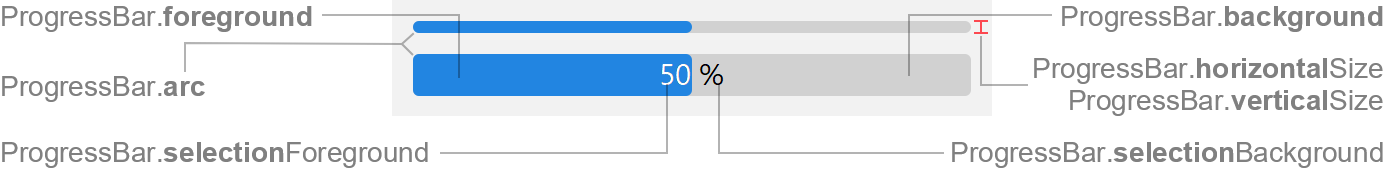
| ProgressBar.background |
background |
bar color |
| ProgressBar.foreground |
foreground |
bar color for completed progress |
| ProgressBar.selectionBackground |
- |
progress text color |
| ProgressBar.selectionForeground |
- |
progress text color for completed progress |
Sizes
| UI Key |
Style Key since v2 |
Type |
Description |
| ProgressBar.arc |
arc |
int |
arc diameter of the bar corners |
| ProgressBar.horizontalSize |
horizontalSize |
Dimension |
preferred size in horizontal orientation |
| ProgressBar.verticalSize |
verticalSize |
Dimension |
preferred size in vertical orientation |
Other
| UI Key |
Style Key since v2 |
Type |
Description |
| ProgressBar.font |
font |
Font |
font used to render progress text |
| ProgressBar.border |
border |
Border |
usually a FlatEmptyBorder |
| ProgressBar.cycleTime |
- |
int |
time until the animation cycle repeats in indeterminate mode (in
milliseconds) |
| ProgressBar.repaintInterval |
- |
int |
interval between repaints in indeterminate mode (in milliseconds) |
Styling since v2
Following properties are only available via styling (not in UI defaults, but has
likewise
client properties).
| Style Key |
Type |
Description |
Client Property |
| largeHeight |
boolean |
if true, the progress bar has always the larger height even if no
string is painted |
JProgressBar.largeHeight |
| square |
boolean |
if true, the progress bar is paint with square edges |
JProgressBar.square |
