ScrollBar
Swing component:
JScrollBar
Swing tutorial:
How to Use Scroll Panes
Properties
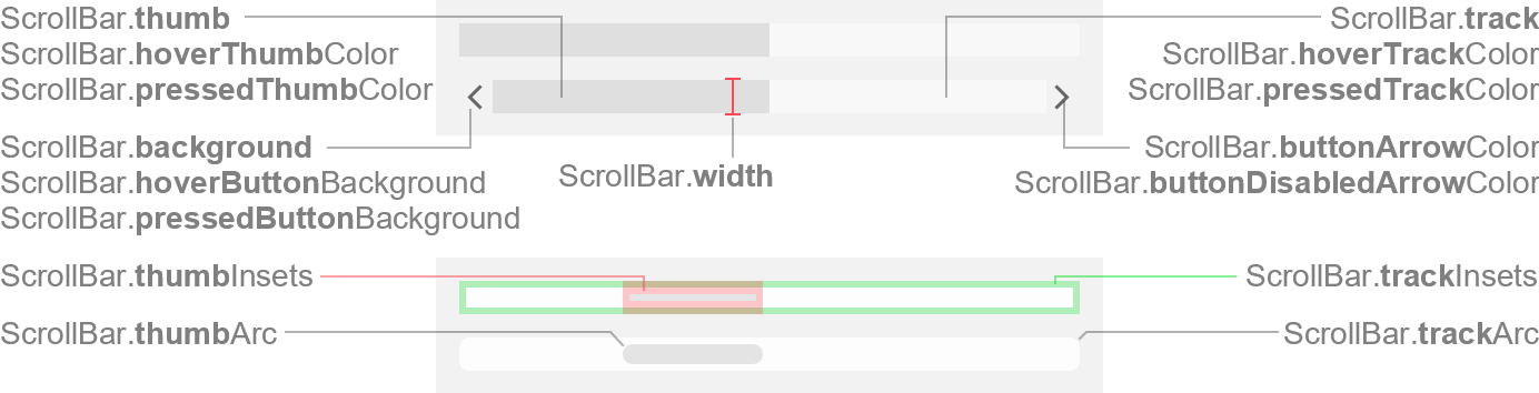
Colors
| UI Key |
Style Key since v2 |
Description |
| ScrollBar.track |
track |
track color |
| ScrollBar.thumb |
thumb |
thumb color |
| ScrollBar.hoverTrackColor |
hoverTrackColor |
track color if mouse is over track (optional) |
| ScrollBar.hoverThumbColor |
hoverThumbColor |
thumb color if mouse is over thumb (optional) |
| ScrollBar.pressedTrackColor |
pressedTrackColor |
track color if mouse is pressed on track (optional) |
| ScrollBar.pressedThumbColor |
pressedThumbColor |
thumb color if mouse is pressed on thumb (optional) |
| ScrollBar.buttonArrowColor |
buttonArrowColor |
arrow color of scroll buttons |
| ScrollBar.buttonDisabledArrowColor |
buttonDisabledArrowColor |
arrow color of scroll buttons if button is disabled |
| ScrollBar.hoverButtonBackground |
hoverButtonBackground |
scroll button background if mouse is over button (optional) |
| ScrollBar.pressedButtonBackground |
pressedButtonBackground |
scroll button background if mouse is pressed on button (optional) |
| ScrollBar.background |
background |
scroll button background |
| ScrollBar.foreground |
foreground |
unused |
Sizes
| UI Key |
Style Key since v2 |
Type |
Description |
| ScrollBar.width |
width |
int |
scroll bar width for vertical orientation, or height for horizontal
orientation |
| ScrollBar.minimumButtonSize since v2.1 |
minimumButtonSize |
Dimension |
minimum size of the scroll arrow buttons, if shown (width is used for
horizontal orientation, height for vertical orientation) |
| ScrollBar.minimumThumbSize |
minimumThumbSize |
Dimension |
minimum size of the thumb (width is used for horizontal orientation,
height for vertical orientation) |
| ScrollBar.maximumThumbSize |
maximumThumbSize |
Dimension |
maximum size of the thumb (width is used for horizontal orientation,
height for vertical orientation) |
| ScrollBar.trackInsets |
trackInsets |
Insets |
space between the component bounds and the track |
| ScrollBar.thumbInsets |
thumbInsets |
Insets |
space between the component bounds and the thumb |
| ScrollBar.trackArc |
trackArc |
int |
arc diameter of the track corners |
| ScrollBar.thumbArc |
thumbArc |
int |
arc diameter of the thumb corners |
Other
| UI Key |
Style Key since v2 |
Type |
Description |
| ScrollBar.showButtons |
showButtons |
boolean |
if true, shows the scroll arrow buttons |
| Component.arrowType |
arrowType |
String |
chevron (default) or triangle |
| ScrollBar.hoverThumbWithTrack |
hoverThumbWithTrack |
boolean |
if true, paints the thumb in hover state if mouse is over track |
| ScrollBar.pressedThumbWithTrack |
pressedThumbWithTrack |
boolean |
if true, paints the thumb in pressed state if mouse is pressed on
track |
| ScrollBar.allowsAbsolutePositioning |
allowsAbsolutePositioning |
boolean |
if true, allows absolute positioning the thumb by pressing the middle
mouse key (or the wheel) anywhere in the track |
