
ComboBox
Swing component:
JComboBox
Swing tutorial:
How to Use Combo Boxes
Properties
For border properties see: FlatRoundBorder
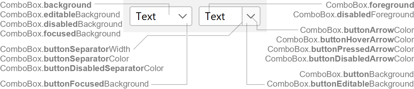
Colors
| UI Key | Style Key since v2 | Description |
|---|---|---|
| ComboBox.foreground | foreground | text color if enabled |
| ComboBox.disabledForeground | disabledForeground | text color if disabled |
| ComboBox.background | background | background color if not editable and enabled |
| ComboBox.editableBackground | editableBackground | background color if editable and enabled (optional; defaults to ComboBox.background) |
| ComboBox.disabledBackground | disabledBackground | background color if disabled |
| ComboBox.focusedBackground | focusedBackground | background color if focused (optional) |
| ComboBox.buttonBackground | buttonBackground | pull-down button background color (optional; if null, button
background is not filled) |
| ComboBox.buttonEditableBackground | buttonEditableBackground | pull-down button background color if editable (optional; if null,
button background is not filled) |
| ComboBox.buttonFocusedBackground | buttonFocusedBackground | pull-down button background color if focused and not editable (optional; defaults to ComboBox.focusedBackground) |
| ComboBox.buttonSeparatorColor since v2 | buttonSeparatorColor | button separator color if enabled (optional; if null, separator is not
painted) |
| ComboBox.buttonDisabledSeparatorColor since v2 | buttonDisabledSeparatorColor | button separator color if disabled (optional; if null, separator is
not painted) |
| ComboBox.buttonArrowColor | buttonArrowColor | arrow color of pull-down button if enabled |
| ComboBox.buttonHoverArrowColor | buttonHoverArrowColor | arrow color of pull-down button if mouse is over button |
| ComboBox.buttonPressedArrowColor | buttonPressedArrowColor | arrow color of pull-down button if mouse is pressed on button |
| ComboBox.buttonDisabledArrowColor | buttonDisabledArrowColor | arrow color of pull-down button is disabled |
| ComboBox.popupBackground | popupBackground | popup list background color (optional) |
| ComboBox.selectionForeground | - | popup list selection text color |
| ComboBox.selectionBackground | - | popup list selection background color |
Sizes
| UI Key | Style Key since v2 | Type | Description |
|---|---|---|---|
| ComboBox.buttonSeparatorWidth since v2 | buttonSeparatorWidth | int or float | line thickness used to paint the separator (optional; defaults to Component.borderWidth) |
| ComboBox.padding | padding | Insets | space between the component border and the text |
| ComboBox.minimumWidth | minimumWidth | int | minimum width of component (in pixels) |
| ComboBox.editorColumns | editorColumns | int | number of visible columns in text field if combo box is editable |
| ComboBox.maximumRowCount | maximumRowCount | int | maximum number of visible rows in popup list |
| ComboBox.popupInsets since v3 | popupInsets | Insets | space between popup border and list in popup |
| ComboBox.selectionInsets since v3 | selectionInsets | Insets | space between cell bounds and cell selection in popup list |
| ComboBox.selectionArc since v3 | selectionArc | int | arc diameter of the selection corners in popup list |
| ComboBox.borderCornerRadius since v3.1 | - | int | popup border corner radius for native borders Note that this is not available on all platforms since it requires special support. Supported platforms:
|
| ComboBox.roundedBorderWidth since v3.3 | - | int or float | popup border width for native borders Note that this is not available on all platforms since it requires special support. Supported platforms:
|
Other
| UI Key | Style Key since v2 | Type | Description |
|---|---|---|---|
| ComboBox.font | font | Font | font used to render text |
| ComboBox.border | border | Border | usually a FlatRoundBorder |
| ComboBox.buttonStyle | buttonStyle | String | style of pull-down button: auto (default; depends on editable flag),
button (button background and separator shown) or none (no button
background and no separator shown) |
| Component.arrowType | arrowType | String | chevron (default) or triangle |