
MenuItem (and subclasses)
Swing components:
JMenuItem,
JItem,
JCheckBoxMenuItem and
JRadioButtonMenuItem
Swing tutorial:
How to Use Menus
Following documentation describes MenuItem, but Menu, CheckBoxMenuItem and
RadioButtonMenuItem have (nearly) same properties. For properties marked with
MCR , replace MenuItem. with Menu., CheckBoxMenuItem. or
RadioButtonMenuItem..
Properties
For icon properties see: Menu Icons
Colors
| UI Key | Style Key since v2 | Description |
|---|---|---|
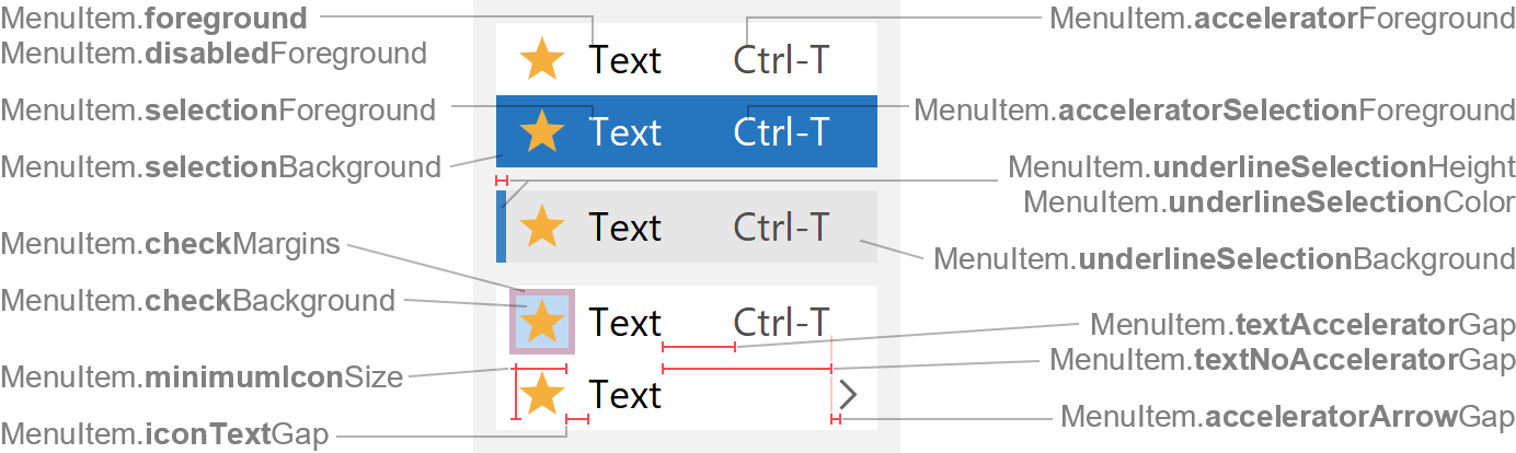
| MenuItem.foreground (MCR) | foreground | text color if enabled |
| MenuItem.disabledForeground (MCR) | disabledForeground | text color if disabled |
| MenuItem.background (MCR) | background | if component is opaque, used to fill background |
| MenuItem.selectionForeground (MCR) | selectionForeground | text color if selected (mouse is over menu item) |
| MenuItem.selectionBackground (MCR) | selectionBackground | background color if selected |
| MenuItem.acceleratorForeground (MCR) | acceleratorForeground | text color of accelerators |
| MenuItem.acceleratorSelectionForeground (MCR) | acceleratorSelectionForeground | text color of accelerators if selected |
| MenuItem.checkBackground | checkBackground | check indicator color; only used if CheckBoxMenuItem or RadioButtonMenuItem is checked (selected) and also has custom icon |
| MenuItem.underlineSelectionColor | underlineSelectionColor | underline selection mark color (for selection type underline) |
| MenuItem.underlineSelectionBackground | underlineSelectionBackground | background color if selected and selection type is underline |
| MenuItem.underlineSelectionCheckBackground | underlineSelectionCheckBackground | similar to MenuItem.checkBackground, but used if selection type is
underline |
Sizes
| UI Key | Style Key since v2 | Type | Description |
|---|---|---|---|
| MenuItem.margin (MCR) | margin | Insets | margin space between the component bounds and icon/text |
| MenuItem.selectionInsets since v3 | selectionInsets | Insets | space between component bounds and selection |
| MenuItem.selectionArc since v3 | selectionArc | int | arc diameter of the selection corners |
| MenuItem.minimumWidth | minimumWidth | int | minimum width of menu item |
| MenuItem.minimumIconSize | minimumIconSize | Dimension | minimum size of menu item icon |
| MenuItem.iconTextGap | iconTextGap | int | gap between icon and text |
| MenuItem.textAcceleratorGap | textAcceleratorGap | int | gap between text and accelerator |
| MenuItem.textNoAcceleratorGap | textNoAcceleratorGap | int | gap between text and arrow if menu item does not have an accelerator |
| MenuItem.acceleratorArrowGap | acceleratorArrowGap | int | gap between accelerator and arrow |
| MenuItem.checkMargins | checkMargins | Insets | margin space between check indicator bounds and menu item icon; only used if CheckBoxMenuItem or RadioButtonMenuItem is checked (selected) and also has custom icon |
| MenuItem.underlineSelectionHeight | underlineSelectionHeight | int | height of underline selection mark (for selection type underline) |
Other
| UI Key | Style Key since v2 | Type | Description |
|---|---|---|---|
| MenuItem.font (MCR) | font | Font | font used to render text |
| MenuItem.acceleratorFont | acceleratorFont | Font | font used to render accelerator text (defaults to MenuItem.font) |
| MenuItem.acceleratorDelimiter | - | String | delimiter used in accelerator (e.g. + in Ctrl+C) |
| MenuItem.border (MCR) | border | Border | usually a FlatMenuItemBorder |
| MenuItem.opaque (MCR) | - | boolean | specifies whether component is opaque |
| MenuItem.arrowIcon (MCR) | - | Icon | arrow icon used for Menu; not used for MenuItem, CheckBoxMenuItem and RadioButtonMenuItem |
| MenuItem.checkIcon (MCR) | - | Icon | check icon used for CheckBoxMenuItem and RadioButtonMenuItem; not used for MenuItem and Menu |
| MenuItem.selectionType | - | String | selection type: if underline, underlines selected menu item (instead
of filling background) |