
Spinner
Swing component:
JSpinner
Swing tutorial:
How to Use Spinners
Properties
For border properties see: FlatRoundBorder
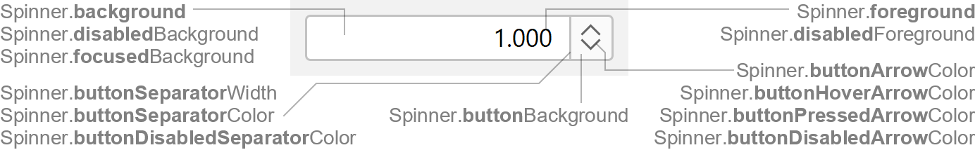
Colors
| UI Key | Style Key since v2 | Description |
|---|---|---|
| Spinner.foreground | foreground | text color if enabled |
| Spinner.disabledForeground | disabledForeground | text color if disabled |
| Spinner.background | background | background color if enabled |
| Spinner.disabledBackground | disabledBackground | background color if disabled |
| Spinner.focusedBackground | focusedBackground | background color if focused (optional) |
| Spinner.buttonBackground | buttonBackground | up/down buttons background color (optional; if null, button background
is not filled) |
| Spinner.buttonSeparatorColor since v2 | buttonSeparatorColor | button separator color if enabled (optional; if null, separator is not
painted) |
| Spinner.buttonDisabledSeparatorColor since v2 | buttonDisabledSeparatorColor | button separator color if disabled (optional; if null, separator is
not painted) |
| Spinner.buttonArrowColor | buttonArrowColor | arrow color of up/down buttons if enabled |
| Spinner.buttonHoverArrowColor | buttonHoverArrowColor | arrow color of up/down buttons if mouse is over button |
| Spinner.buttonPressedArrowColor | buttonPressedArrowColor | arrow color of up/down buttons if mouse is pressed on button |
| Spinner.buttonDisabledArrowColor | buttonDisabledArrowColor | arrow color of up/down buttons is disabled |
Sizes
| UI Key | Style Key since v2 | Type | Description |
|---|---|---|---|
| Spinner.buttonSeparatorWidth since v2 | buttonSeparatorWidth | int or float | line thickness used to paint the separator (optional; defaults to Component.borderWidth) |
| Spinner.padding | padding | Insets | space between the component border and the text |
| Component.minimumWidth | minimumWidth | int | minimum width of component (in pixels) |
Other
| UI Key | Style Key since v2 | Type | Description |
|---|---|---|---|
| Spinner.font | font | Font | font used to render text |
| Spinner.border | border | Border | usually a FlatRoundBorder |
| Spinner.buttonStyle | buttonStyle | String | style of up/down buttons: button (default; button background and
separator shown) or none (no button background and no separator shown) |
| Component.arrowType | arrowType | String | chevron (default) or triangle |
| Spinner.disableOnBoundaryValues | - | boolean | if true, up/down buttons are disabled on boundary values |
| Spinner.editorAlignment | - | int | horizontal alignment of text (0=center, 2=left, 4=right, 10=leading, 11=trailing) |
| Spinner.editorBorderPainted | - | boolean | if true, paint inner editor border |