SplitPane
Swing component:
JSplitPane
Swing tutorial:
How to Use Split Panes
Properties
Colors
| UI Key |
Style Key since v2 |
Description |
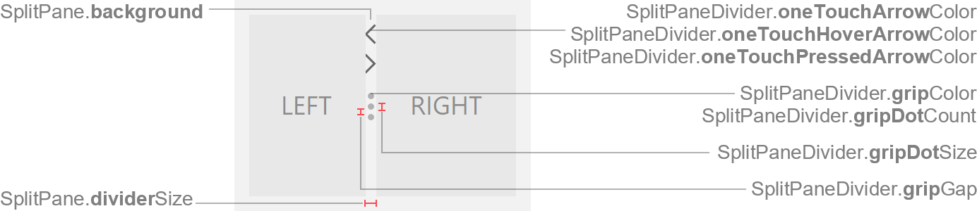
| SplitPane.background |
background |
background color |
| SplitPane.foreground |
foreground |
unused |
| SplitPaneDivider.gripColor |
gripColor |
dot color in grip |
| SplitPaneDivider.oneTouchArrowColor |
oneTouchArrowColor |
arrow color of expand/collapse buttons in divider |
| SplitPaneDivider.oneTouchHoverArrowColor |
oneTouchHoverArrowColor |
arrow color of expand/collapse buttons in divider if mouse is over
button |
| SplitPaneDivider.oneTouchPressedArrowColor |
oneTouchPressedArrowColor |
arrow color of expand/collapse buttons in divider if mouse is pressed on
button |
| SplitPaneDivider.hoverColor since v3.3 |
hoverColor |
divider background color if mouse is over divider (optional) |
| SplitPaneDivider.pressedColor since v3.3 |
pressedColor |
divider background color if mouse is pressed on divider and
continuousLayout is enabled (optional) |
| SplitPaneDivider.draggingColor |
draggingColor since v3.3 |
divider background color while dragging if continuousLayout is disabled |
Sizes
| UI Key |
Style Key since v2 |
Type |
Description |
| SplitPane.dividerSize |
dividerSize |
int |
divider width for horizontal orientation, or height for vertical
orientation |
| SplitPane.oneTouchButtonSize |
- |
int |
width of one-touch buttons (in horizontal orientation) |
| SplitPane.oneTouchButtonOffset |
- |
int |
gap between upper one-touch button and top split pane edge (in
horizontal orientation) |
Other
| UI Key |
Style Key since v2 |
Type |
Description |
| Component.arrowType |
arrowType |
String |
chevron (default) or triangle |
| SplitPaneDivider.style |
style |
String |
divider style: grip (default) or plain |
| SplitPaneDivider.gripDotCount |
gripDotCount |
int |
count of shown dots |
| SplitPaneDivider.gripDotSize |
gripDotSize |
int |
diameter of a single dot |
| SplitPaneDivider.gripGap |
gripGap |
int |
gap between dots |
| SplitPane.border |
border |
Border |
usually null |
| SplitPaneDivider.border |
- |
Border |
usually null |
| SplitPane.continuousLayout |
- |
boolean |
if true, the components are continuously redrawn while dragging the
divider |
| SplitPane.centerOneTouchButtons |
- |
boolean |
if true, centers the one-touch buttons within the divider width;
otherwise they are placed to left/top side of divider |
| SplitPane.supportsOneTouchButtons |
- |
boolean |
if true, one-touch buttons are supported (if enabled); if false,
one-touch buttons are never shown |
