
TabbedPane
Swing component:
JTabbedPane
Swing tutorial:
How to Use Tabbed Panes
Properties
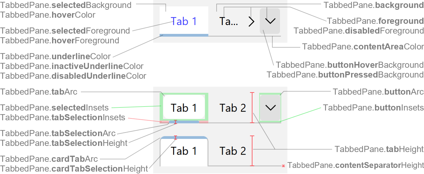
Colors
| UI Key | Style Key since v2 | Description |
|---|---|---|
| TabbedPane.foreground | foreground | tab text and forward/backward/more icon color if enabled |
| TabbedPane.disabledForeground | disabledForeground | tab text and forward/backward/more icon color if disabled |
| TabbedPane.background | background | tab area background color |
| TabbedPane.selectedForeground | selectedForeground | tab text color if selected (optional) |
| TabbedPane.selectedBackground | selectedBackground | tab background color if selected (optional) |
| TabbedPane.underlineColor | underlineColor | tab underline selection mark color if selected and (child) focused |
| TabbedPane.inactiveUnderlineColor since v2.2 | inactiveUnderlineColor | tab underline selection mark color if selected but not (child) focused |
| TabbedPane.disabledUnderlineColor | disabledUnderlineColor | tab underline selection mark color if selected and disabled |
| TabbedPane.hoverForeground since v3.1 | hoverForeground | tab text color if mouse is over tab (optional) |
| TabbedPane.hoverColor | hoverColor | tab background color if mouse is over tab (optional) |
| TabbedPane.focusForeground since v3.1 | focusForeground | tab text color if tabbed pane is focused (optional) |
| TabbedPane.focusColor | focusColor | tab background color if tabbed pane is focused (optional) |
| TabbedPane.tabSeparatorColor | tabSeparatorColor | tab separator color and tab card border color (optional; defaults to TabbedPane.contentAreaColor) |
| TabbedPane.contentAreaColor | contentAreaColor | content separator color (line between tab area and content), content border color (if enabled with TabbedPane.hasFullBorder) and card border color |
| TabbedPane.buttonHoverBackground | buttonHoverBackground | forward/backward/more buttons background color if mouse is over button |
| TabbedPane.buttonPressedBackground | buttonPressedBackground | forward/backward/more buttons background color if mouse is pressed on button |
Sizes
| UI Key | Style Key since v2 | Type | Description |
|---|---|---|---|
| TabbedPane.tabAreaInsets | tabAreaInsets | Insets | margin space between the tabbed pane bounds and the tab area |
| TabbedPane.tabInsets | tabInsets | Insets | margin space between the tab bounds and the text |
| TabbedPane.textIconGap | textIconGap | int | gap between icon and text |
| TabbedPane.minimumTabWidth | minimumTabWidth | int | minimum width of a tab (optional) |
| TabbedPane.maximumTabWidth | maximumTabWidth | int | maximum width of a tab (optional) |
| TabbedPane.tabHeight | tabHeight | int | minimum height of a tab |
| TabbedPane.tabSelectionHeight | tabSelectionHeight | int | height of underline selection mark (for tab type underlined) |
| TabbedPane.cardTabSelectionHeight since v2 | cardTabSelectionHeight | int | height of card selection mark (for tab type card) |
| TabbedPane.tabArc since v3.2 | tabArc | int | arc diameter of the tab background corners (for tab type underlined) |
| TabbedPane.tabSelectionArc since v3.2 | tabSelectionArc | int | arc diameter of the underline selection mark (for tab type underlined) |
| TabbedPane.cardTabArc since v3.2 | cardTabArc | int | arc diameter of the card border corners (for tab type card) |
| TabbedPane.selectedInsets since v3.2 | selectedInsets | Insets | insets of the tab background (for tab type underlined) |
| TabbedPane.tabSelectionInsets since v3.2 | tabSelectionInsets | Insets | insets of the underline selection mark (for tab type underlined) |
| TabbedPane.contentSeparatorHeight | contentSeparatorHeight | int | thickness of content separator (line between tab area and content), content border (if enabled with TabbedPane.hasFullBorder) and card border |
| TabbedPane.buttonInsets | buttonInsets | Insets | margin space between the forward/backward/more buttons bounds and the icon |
| TabbedPane.buttonArc | buttonArc | int | arc diameter of the forward/backward/more buttons border corners |
| TabbedPane.tabRunOverlay | - | int | specifies overlapping of tab runs (rows) in scroll layout policy |
Other
| UI Key | Style Key since v2 | Type | Description |
|---|---|---|---|
| TabbedPane.font | font | Font | font used to render text |
| TabbedPane.tabsOpaque | tabsOpaque | boolean | if true, fill tab area background |
| TabbedPane.opaque | - | boolean | if true, sets property JTabbedPane.opaque to true |
| TabbedPane.selectionFollowsFocus | - | boolean | if true, some key combinations are available to switch to
next/previous tab using keyboard (e.g. Ctrl+Tab,
Ctrl+Shift+Tab, Ctrl+PageDown or
Ctrl+PageUp); default is true |
| TabbedPane.showTabSeparators | showTabSeparators | boolean | if true, shows separator lines between tabs |
| TabbedPane.tabSeparatorsFullHeight | tabSeparatorsFullHeight | boolean | if true, tab separators have full height of tab area |
| TabbedPane.hasFullBorder | hasFullBorder | boolean | if true, shows a border around the content area |
| TabbedPane.rotateTabRuns since v2.5 | rotateTabRuns | boolean | if true, tab runs (rows) in scroll layout policy are reordered so that
the row that contains the selected tab is placed next to the content |
| TabbedPane.tabLayoutPolicy | - | String | wrap (default) or scroll |
| TabbedPane.tabType | tabType | String | type of the selected tab:
|
| TabbedPane.tabsPopupPolicy | tabsPopupPolicy | String | display policy for the "more tabs" button, which shows a popup menu with the (partly) hidden tabs:
|
| TabbedPane.scrollButtonsPolicy | scrollButtonsPolicy | String | display policy for the forward/backward scroll arrow buttons:
|
| TabbedPane.scrollButtonsPlacement | scrollButtonsPlacement | String | placement of the forward/backward scroll arrow buttons.:
|
| TabbedPane.tabAreaAlignment | tabAreaAlignment | String | alignment of the tab area within the tabbed pane:
|
| TabbedPane.tabAlignment | tabAlignment | String | horizontal alignment of the tab title and icon:
|
| TabbedPane.tabWidthMode | tabWidthMode | String | specifies how the tabs should be sized:
|
| TabbedPane.tabRotation since v3.3 | tabRotation | String | specifies the rotation of the tabs (title, icon, etc.):
|
| TabbedPane.closeIcon | - | Icon | icon used for close buttons; usually a FlatTabbedPaneCloseIcon |
| TabbedPane.arrowType | arrowType | String | chevron (default) or triangle |
| TabbedPane.moreTabsButtonToolTipText | moreTabsButtonToolTipText | String | tooltip text used for "more tabs" button |
| TabbedPane.tabCloseToolTipText since v2 | tabCloseToolTipText | String | tooltip text used for tab close buttons |
Styling since v2
Following properties are only available via styling (not in UI defaults, but has likewise client properties).
| Style Key | Type | Description | Client Property |
|---|---|---|---|
| showContentSeparator | boolean | if true, shows separator between tabs area and content area |
JTabbedPane.showContentSeparator |
| hideTabAreaWithOneTab | boolean | if true, hides tab area if it contains only one tab |
JTabbedPane.hideTabAreaWithOneTab |
| tabClosable | boolean | if Note that you have to specify a callback (see client property JTabbedPane.tabCloseCallback that is invoked when the user clicks a tab close button. The callback is responsible for closing the tab. |
JTabbedPane.tabClosable |
| tabIconPlacement | int | tab icon placement (relative to tab title):
|