
Windows 10/11 Title Bar
Properties
Colors
| UI Key | Description |
|---|---|
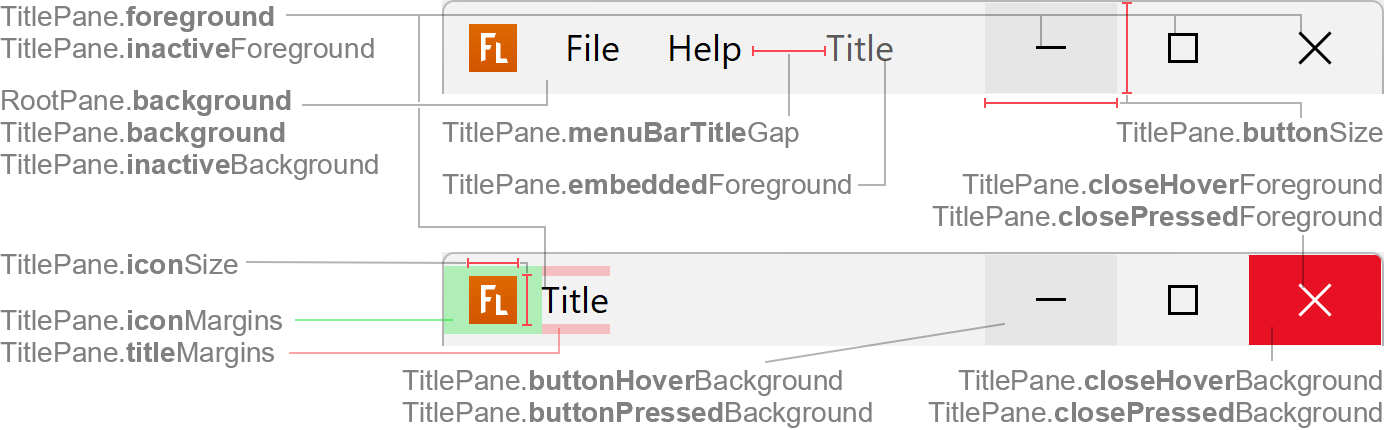
| TitlePane.background | title bar background color if window is active and unified background is disabled (RootPane.background is used for unified background) |
| TitlePane.inactiveBackground | title bar background color if window is inactive and unified background is disabled (RootPane.background is used for unified background) |
| TitlePane.foreground | title text color and buttons icon color if window is active |
| TitlePane.embeddedForeground | title text color if window is active and has an embedded menu bar |
| TitlePane.inactiveForeground | title text color and buttons icon color if window is inactive |
| TitlePane.borderColor | if set, a line with that color is painted at the bottom of the title bar (optional) |
| TitlePane.buttonHoverBackground | button background color if mouse is over button |
| TitlePane.buttonPressedBackground | button background color if mouse is pressed on button |
| TitlePane.closeHoverBackground | "Close" button background color if mouse is over button |
| TitlePane.closePressedBackground | "Close" button background color if mouse is pressed on button |
| TitlePane.closeHoverForeground | "Close" button icon color if mouse is over button |
| TitlePane.closePressedForeground | "Close" button icon color if mouse is pressed on button |
Sizes
| UI Key | Type | Description |
|---|---|---|
| TitlePane.noIconLeftGap since v2 | int | gap on left side of title bar if no icon is shown |
| TitlePane.iconSize | Dimension | size of icon in title bar |
| TitlePane.iconMargins | Insets | margin around the icon |
| TitlePane.titleMargins | Insets | margin around the title text |
| TitlePane.titleMinimumWidth since v2.4 | int | minimum width of title |
| TitlePane.buttonMaximizedHeight | int | preferred height of title bar if frame is maximized (used to make title bar height slightly smaller when maximized) |
| TitlePane.menuBarTitleGap | int | gap between embedded menu bar and title text if title is not centered |
| TitlePane.menuBarTitleMinimumGap since v2.4 | int | minimum gap between embedded menu bar and title text if title is not centered (if horizontal space is rare, the gap is shrinked to this width) |
| TitlePane.menuBarResizeHeight since v2.4 | int | height of area at top of embedded menu bar to resize the window |
| TitlePane.buttonSize | Dimension | size of title bar buttons (e.g. "Close") |
| TitlePane.buttonMinimumWidth since v2.4 | int | minimum width of title bar buttons (if horizontal space is rare, the buttons are shrinked to this width) |
| TitlePane.buttonSymbolHeight since v3.2 | int | size of symbols in title bar buttons (e.g. "Close") |
Other
| UI Key | Type | Description |
|---|---|---|
| TitlePane.font since v2.5 | Font | font used to render title text (optional; defaults to Label.font) |
| TitlePane.unifiedBackground | boolean | if true, the title bar uses same background color as content area
(RootPane.background) |
| TitlePane.showIcon since v2 | boolean | specifies whether window icon is shown |
| TitlePane.showIconInDialogs since v2.5 | boolean | if true, shows window icon in dialogs; if false, do not show icon in
dialogs (but in frames) (default is true) |
| TitlePane.showIconBesideTitle since v2.4 | boolean | if true, the window icon is shown beside the window title (e.g.
horizontally centered in frame with embedded menu bar) |
| TitlePane.menuBarEmbedded | boolean | if true, menu bar is embedded into title bar |
| TitlePane.centerTitle | boolean | specifies whether title text is centered if title bar does not have an embedded menu bar |
| TitlePane.centerTitleIfMenuBarEmbedded | boolean | specifies whether title text is centered if title bar has an embedded menu bar |
| TitlePane.closeIcon | Icon | icon used for "Close" button (FlatWindowCloseIcon) |
| TitlePane.iconifyIcon | Icon | icon used for "Minimize" button (FlatWindowIconifyIcon) |
| TitlePane.maximizeIcon | Icon | icon used for "Maximize" button (FlatWindowMaximizeIcon) |
| TitlePane.restoreIcon | Icon | icon used for "Restore" button (FlatWindowRestoreIcon) |