
Documentation
FormLayout (JGoodies)
FormLayout is a powerful, flexible and precise general purpose layout manager. It places components in a grid of columns and rows, allowing specified components to span multiple columns or rows. Not all columns/rows necessarily have the same width/height.
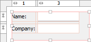
Unlike other grid-based layout managers, FormLayout uses 1-based column/row indices. And it uses "real" columns/rows as gaps. Therefore the unusual column/row numbers in the above screenshot. Using gap columns/rows has the advantage that you can give gaps different sizes.
Use the column and row headers to insert or delete columns/rows and change column/row properties. JFormDesigner automatically adds/removes gap columns if you add/remove a column/row.
Compared to other layout managers, FormLayout provides following outstanding features:
- Default alignment of components in a column/row.
- Specification of minimum and maximum column width or row height.
- Supports different units: Dialog units, Pixel, Point, Millimeter, Centimeter and Inch. Especially Dialog units are very useful to create layouts that scale with the screen resolution.
- Column/row templates.
- Column/row grouping.
FormLayout is open source and not part of the standard Java distribution.
You must ship two additional libraries with your application. JFormDesigner
includes jgoodies-forms.jar and jgoodies-common.jar in its
redistributables. For more documentation and
tutorials, visit
www.jgoodies.com/freeware/libraries/forms/.
Maven Central: groupId: com.jgoodies artifactId: jgoodies-forms
version: 1.8.0
API documentation:
doc.formdev.com/jgoodies-forms/
Source code:
github.com/JFormDesigner/swing-jgoodies-forms
IDE plugins: If you use FormLayout the first time, the JFormDesigner IDE plugin ask you whether it should copy the required libraries (and its source code and documentation) to the IDE project and add it to the classpath of the IDE project.
Layout manager properties
A container with this layout manager has following layout manager properties:
| Property Name | Description |
|---|---|
| columnSpecs | Comma separated encoded column specifications. This property is for experts only. Use the column header instead of editing this property. |
| rowSpecs | Comma separated encoded row specifications. This property is for experts only. Use the row header instead of editing this property. |
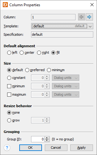
Column/row properties
Each column and row has its own properties. Use the column and row headers to change column/row properties.
| Field | Description |
|---|---|
| Column/Row | The index of the column/row. Use the arrow buttons (or Alt+Left, Alt+Right, Alt+Up, Alt+Down keys) to edit the properties of the previous or next column/row. |
| Template | FormLayout provides several predefined templates for columns and rows. Here you can choose one. |
| Specification | The column/row specification. This is a string representation of the options below. |
| Default alignment | The default alignment of the components within a column/row. Used if the value of the component constraint properties "h align" or "v align" are set to DEFAULT. |
| Size | The width of a column or height of a row. You can use default, preferred or minimum component size. Or a constant size. It is also possible to specify a minimum and a maximum size. Note that the maximum size does not limit the column/row size if the column/row can grow (see resize behavior). |
| Resize behavior | The resize weight of the column/row. |
| Grouping | See column/row grouping for details. |
Tip: The column/row context menu allows you to alter many of these options for multi-selections.
Layout constraints properties
A component contained in a container with this layout manager has following layout constraints properties:
| Property Name | Description | Default |
|---|---|---|
| grid x | Specifies the component's horizontal grid origin (column index). | 1 |
| grid y | Specifies the component's vertical grid origin (row index). | 1 |
| grid width | Specifies the component's horizontal grid extend (number of columns). | 1 |
| grid height | Specifies the component's vertical grid extend (number of rows). | 1 |
| h align | The horizontal alignment of the component within its cell. Possible values: DEFAULT, LEFT, CENTER, RIGHT and FILL. | DEFAULT |
| v align | The vertical alignment of the component within its cell. Possible values: DEFAULT, TOP, CENTER, BOTTOM and FILL. | DEFAULT |
| insets | Specifies the external padding of the component, the minimum amount of
space between the component and the edges of its display area. Note that the insets do not increase the column width or row height (in contrast to the GridBagConstraints.insets). |
0,0,0,0 |
Tip: The component context menu allows you to alter the alignment for multi-selections.
Column/Row Templates
FormLayout provides several predefined templates for columns and rows. You can also define custom column/row templates in the Preferences dialog.
Column templates
| Name | Description | Gap |
|---|---|---|
| default | Determines the column width by computing the maximum of all column component preferred widths. If there is not enough space in the container, the column can shrink to the minimum width. | no |
| preferred | Determines the column width by computing the maximum of all column component preferred widths. | no |
| minimum | Determines the column width by computing the maximum of all column component minimum widths. | no |
| related gap | A logical horizontal gap between two related components. For example the OK and Cancel buttons are considered related. | yes |
| unrelated gap | A logical horizontal gap between two unrelated components. | yes |
| label component gap | A logical horizontal gap between a label and an associated component. | yes |
| glue | Has an initial width of 0 pixels and grows. Useful to describe glue columns that fill the space between other columns. | yes |
| button | A logical horizontal column for a fixed size button. | no |
| growing button | A logical horizontal column for a growing button. | no |
Row templates
| Name | Description | Gap |
|---|---|---|
| default | Determines the row height by computing the maximum of all row component preferred heights. If there is not enough space in the container, the row can shrink to the minimum height. | no |
| preferred | Determines the row height by computing the maximum of all row component preferred heights. | no |
| minimum | Determines the row height by computing the maximum of all row component minimum heights. | no |
| related gap | A logical vertical gap between two related components. | yes |
| unrelated gap | A logical vertical gap between two unrelated components. | yes |
| label component gap | A logical vertical gap between a label and an associated component. (requires JGoodies Forms 1.4 or later) |
yes |
| narrow line gap | A logical vertical narrow gap between two rows. Useful if the vertical space is scarce or if an individual vertical gap shall be smaller than the default line gap. | yes |
| line gap | A logical vertical default gap between two rows. A little bit larger than the narrow line gap. | yes |
| paragraph gap | A logical vertical default gap between two paragraphs in the layout grid. This gap is larger than the default line gap. | yes |
| glue | Has an initial height of 0 pixels and grows. Useful to describe glue rows that fill the space between other rows. | yes |