

Documentation
null Layout
null layout is not a real layout manager. It means that no layout manager is assigned and the components can be put at specific x,y coordinates.
It is useful for making quick prototypes. But it is not recommended for production because it is not portable. The fixed locations and sizes do not change with the environment (e.g. different fonts on various platforms).
Preferred sizes
JFormDesigner supports preferred sizes of child components. This solves one common problem of null layout: the component sizes change with the environment (e.g. different fonts on various platforms). Unlike other GUI designers, no additional library is required.
Grid
To make it easier to align components, the component edges snap to an invisible grid when moving or resizing components. You can specify the grid step size in the Preferences dialog. To temporary disable grid snapping, hold down the Shift key while moving or resizing components.
Keyboard
You can move selected components with Ctrl+ArrowKey and change size with Shift+ArrowKey.
Aligning components
The align commands help you to align a set of components or make them same width or height.
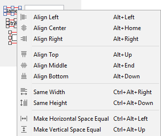
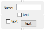
The dark blue handles in the above screenshot indicate the first selected component.
| Command | Description | |
|---|---|---|
 |
Align Left | Line up the left edges of the selected components with the left edge of the first selected component. |
 |
Align Center | Horizontally line up the centers of the selected components with the center of the first selected component. |
 |
Align Right | Line up the right edges of the selected components with the right edge of the first selected component. |
 |
Align Top | Line up the top edges of the selected components with the top edge of the first selected component. |
 |
Align Middle | Vertically line up the centers of the selected components with the center of the first selected component. |
 |
Align Bottom | Line up the bottom edges of the selected components with the bottom edge of the first selected component. |
 |
Same Width | Make the selected components all the same width as the first selected component. |
 |
Same Height | Make the selected components all the same height as the first selected component. |
 |
Make Horizontal Space Equal |
Makes the horizontal space between 3 or more selected components equal. The leftmost and rightmost components stay unchanged. The other components are horizontally distributed between the leftmost and rightmost components. |
 |
Make Vertical Space Equal |
Makes the vertical space between 3 or more selected components equal. The topmost and bottommost components stay unchanged. The other components are vertically distributed between the topmost and bottommost components. |
Layout manager properties
A container with this layout manager has following layout manager properties:
| Property Name | Description | Default |
|---|---|---|
| auto-size | If true, computes the size of the container so that all children are entire visible. If false, the size of the container in the Design view is used. | true |
Layout constraints properties
A component contained in a container with this layout manager has following layout constraints properties:
| Property Name | Description | Default |
|---|---|---|
| x | The x coordinate of the component relative to the left corner of the container. | 0 |
| y | The y coordinate of the component relative to the upper corner of the container. | 0 |
| width | The width of the component in pixel or Preferred. If set to Preferred, the component's preferred width is used. | Preferred |
| height | The height of the component in pixel or Preferred. If set to Preferred, the component's preferred width is used. | Preferred |