
Documentation
GroupLayout (Free Design)
The goal of the group layout manager is to make it easy to create professional cross platform layouts. It is designed for GUI builders, such as JFormDesigner, to use the "Free Design" paradigm. You can lay out your forms by simply placing components where you want them. Visual guidelines suggest optimal spacing, alignment and resizing of components.
GroupLayout has been developed by the NetBeans team and is also used by the NetBeans GUI Builder (formerly Project Matisse). They provide a comprehensive tutorial on designing GUIs using GroupLayout, which is also suitable for JFormDesigner: netbeans.apache.org/kb/docs/java/quickstart-gui.html
GroupLayout is part of the standard Java distribution. The API documentation is available here.
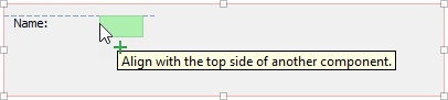
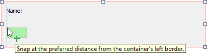
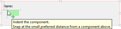
Alignment guidelines
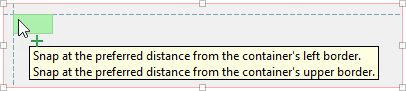
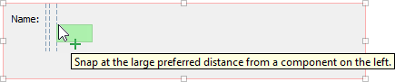
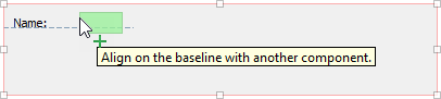
Alignment guidelines appear only when adding or moving components. They indicate the preferred positions to which components snap when releasing the mouse button.
Insets are the preferred spacings between components and their container.
Offsets are the preferred spacings between adjacent components.
Baseline alignment is the preferred relationship between adjacent components that display text.
Edge alignments (top, bottom, left and right) are possible relationships between adjacent components.
Indentation alignment is a special alignment relationship in which one component is located below another and offset slightly to the right.
Anchoring indicators
Anchoring indicators appear when components have snapped into position. They illustrate the alignment and relationship among components.
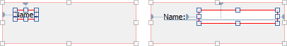
Anchors connecting components to their container or to adjacent components are represented by small semi-circular indicators with dashed lines.
Visualization of gaps
The gaps between components are visualized as light gray rectangles. Fixed size gaps are solid and resizable gaps are shown with springs inside. Adjacent gaps are shown when a component is selected. All gaps between all components are shown if a container is selected.
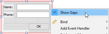
To disable visualization of gaps, right-click on a GroupLayout container and deselect Show Gaps.
Commands
The designer context menu provides following GroupLayout specific commands:
| Command | Description | |
|---|---|---|
      |
Align in column/row | Aligns the selected components left/right/top/bottom/center in column/row. |
    |
Align | Aligns the selected components left/right/top/bottom. |
    |
Anchor | Changes the anchoring of the selected components. A component is usually horizontally anchored left/right and vertically anchored top/bottom. Anchoring connects a component to a container edge or a neighborhood component edge. |
 |
Horizontal Auto Resizing | Makes the selected components resize horizontally at runtime if the container size changes. |
 |
Vertical Auto Resizing | Makes the selected components resize vertically at runtime if the container size changes. |
 |
Same Width | Makes the selected components all the same width. If one of the selected
components is already in a group of "Same Width" components, the other
components are added to the existing group. To remove components from a
group, select them and then execute this command. Grouped components are
marked with a small indicator. |
 |
Same Height | Makes the selected components all the same height. See "Save Width" command for more details. |
| Set to Default Size | Makes the selected components have its default size. | |
| Edit Layout Space | Changes the gaps around the selected component. | |
| Show Gaps | Shows/hides the gaps around the selected components. | |
| Duplicate | Duplicates the selected components and places the new components below the original components. Use Ctrl+Left, Ctrl+Right, Ctrl+Up or Ctrl+Down keys to place the duplicated components left, right, above or below the original components. | |
Layout manager properties
A container with this layout manager has following layout manager properties:
| Property Name | Description | Default |
|---|---|---|
| honors visibility | Specifies whether component visibility is considered when positioning and sizing components. If true, non-visible components are not treated as part of the layout. If false, components are positioned and sized regardless of visibility. | true |
Layout constraints properties
A component contained in a container with this layout manager has following layout constraints properties:
| Property Name | Description | Default |
|---|---|---|
| horizontal size | Specifies the component's horizontal size in pixel or Default. If set to Default, the component's preferred width is used. | Default |
| vertical size | Specifies the component's vertical size in pixel or Default. If set to Default, the component's preferred height is used. | Default |
| horizontal resizable | Specifies whether the component is horizontal resizable. | false |
| vertical resizable | Specifies whether the component is vertical resizable. | false |
| top gap | Specifies size of the top gap. | |
| left gap | Specifies size of the left gap. | |
| bottom gap | Specifies size of the bottom gap. | |
| right gap | Specifies size of the right gap. | |
| top gap resizable | Specifies whether the top gap is vertical resizable. | false |
| left gap resizable | Specifies whether the left gap is horizontal resizable. | false |
| bottom gap resizable | Specifies whether the bottom gap is vertical resizable. | false |
| right gap resizable | Specifies whether the right gap is horizontal resizable. | false |