Documentation
Property Editors
Property editors are used in the Properties view to edit property values.
You can either edit a value directly in the property table or use a custom
property editor by clicking on the ellipsis button
( ) on the right side. The custom
editor pops up in a new dialog.
) on the right side. The custom
editor pops up in a new dialog.
The type of the editor depends on the data type of the property. JFormDesigner
has built-in property editors for all standard data types. Custom JavaBeans can
provide their own property editors. Take a look at the API documentation of
java.beans.PropertyEditor, java.beans.PropertyDescriptor and
java.beans.BeanInfo and the JavaBeans topic for details.
Built-in property editors
JFormDesigner has built-in property editors for following data types:
- String,
String[],
boolean,byte,char,double,float,int,long,short,java.lang.Boolean,java.lang.Byte,java.lang.Character,java.lang.Class,java.lang.Double,java.lang.Float,java.lang.Integer,java.lang.Long,java.lang.Short,java.math.BigDecimalandjava.math.BigInteger - ActionMap (javax.swing)
- Border (javax.swing)
- Color (java.awt)
- ComboBoxModel (javax.swing)
- Cursor (java.awt)
- Dimension (java.awt)
- Font (java.awt)
- Icon (javax.swing)
- Image (java.awt)
- InputMap (javax.swing)
- Insets (java.awt)
- KeyStroke (javax.swing)
- ListModel (javax.swing)
- Object (java.lang)
- Paint (java.awt)
- Point (java.awt)
- Rectangle (java.awt)
- SpinnerModel (javax.swing)
- TableModel (javax.swing)
- TreeModel (javax.swing)
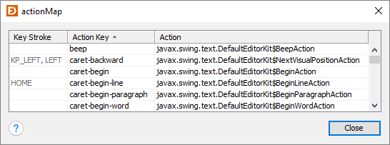
ActionMap (javax.swing)
This (read-only) custom editor allows you to see the actions registered for a component in its action map. The information in the column "Key Stroke" comes from the input map of the component and shows which key strokes are assigned to actions. The JComponent property "actionMap" is read-only. Expand the Read-only Properties category in the Properties view to make it visible.
Border (javax.swing)
You can either select a border from the combo box in the properties table or use the custom editor.
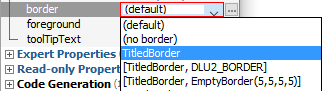
In the custom editor you can edit all border properties. Use the combo box at the top of the dialog to choose a border type. In the mid area of the dialog you can edit the border properties. This area is different for each border type. At the bottom, you can see a preview of the border.
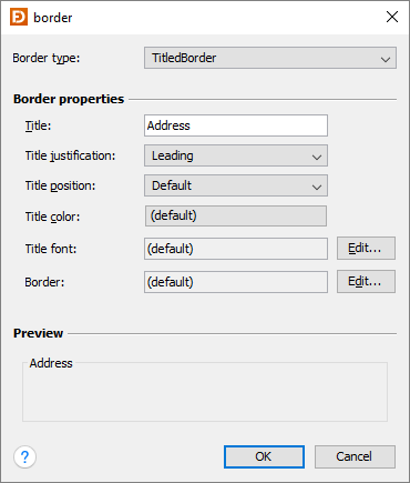
Following border types are supported:
BevelBorderCompoundBorderDropShadowBorder(SwingX)EmptyBorderEmptyBorder(JGoodies)EtchedBorderLineBorderMatteBorderSoftBevelBorderTitledBorder- Swing look and feel
- custom borders
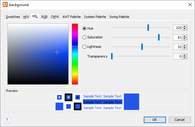
Color (java.awt)
In the properties table, you can either enter RGB values, color names, system color names or Swing UIManager color names. When using an RGB value, you can also specify the alpha value by adding a fourth number.

The custom editor supports various ways to specify a color. Besides RGB, you can select a color from the AWT, System or Swing palettes.
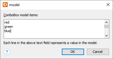
ComboBoxModel (javax.swing)
This custom editor allows you to specify string values for a combo box.
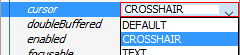
Cursor (java.awt)
This editor allows you to choose a predefined cursor.
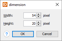
Dimension (java.awt)
Either edit the dimension in the property table or use the custom editor.

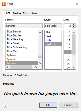
Font (java.awt)
You can either use absolute fonts, derived fonts or predefined fonts of the look and feel. Derived fonts are recommended if you just need a bold/italic or a larger/smaller font (e.g. for titles), because derived fonts are computed based on the current look and feel. If your application runs on several look and feels (e.g. several operating systems), derived fonts ensure that the font family stays consistent.
In the properties table, you can quickly change the style (bold and italic) and the size of the font.

In the custom editor you can choose one of the tabs to specify either absolute fonts, derived fonts or predefined fonts.
 |
 |
Icon (javax.swing) and Image (java.awt)
This custom editor allows you to choose an icon. It supports bitmap images (PNG,
GIF and JPEG) and vector graphics (SVG). When using SVG, then class
FlatSVGIcon from
FlatLaf Extras
is required.
Click the plus button in the properties table to open the default custom editor, which allows you to use an icon from the project resources.
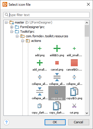 |
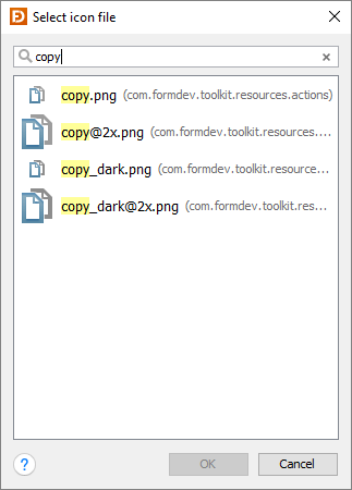 |
Click the ellipsis button in the properties table to open the extended custom editor, which allows you to use an icon from the project resources, from the file system or from the Swing UIManager (look and feel). It is recommended to use the project resources and embed your icons into your application JAR.
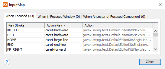
InputMap (javax.swing)
This (read-only) custom editor allows you to see the key strokes registered for a component in its input map. The information in the column "Action" comes from the action map of the component and shows which action classes are assigned to key strokes. The JComponent property "inputMap" is read-only. Expand the Read-only Properties category in the Properties view to make it visible.
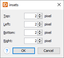
Insets (java.awt)
Either edit the insets in the property table or use the custom editor.

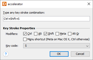
KeyStroke (javax.swing)
In the properties table, you can enter a string representation of the keystroke. E.g. "Ctrl+C" or "Ctrl+Shift+S".
The custom editor supports two ways to specify a keystroke. Either type any key stroke combination if the focus is in the first field or use the controls below.
The KeyStroke editor supports menu shortcut modifier key (Command key on the Mac, Ctrl key otherwise).
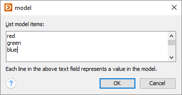
ListModel (javax.swing)
This custom editor allows you to specify string values for a list.
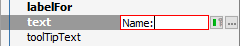
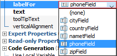
Object (java.lang)
This editor allows you to reference any (non-visual) JavaBean as a property
value. Often used for JLabel.labelFor.
Paint (java.awt)
This editor allows you to specify a java.awt.Paint object (used by
java.awt.Graphics2D). Use the combo box at the top of the dialog to choose a
paint type. In the mid area of the dialog you can edit the paint properties.
This area is different for each paint type. At the bottom, you can see a preview
of the paint. For GradientPaint you can click-and-drag the handles in the
preview area to move the points.
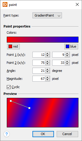
Following paint types are supported:
ColorGradientPaint
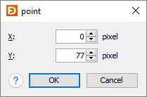
Point (java.awt)
Either edit the point in the property table or use the custom editor.

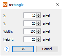
Rectangle (java.awt)
Either edit the rectangle in the property table or use the custom editor.

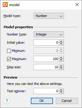
SpinnerModel (javax.swing)
This custom editor allows you to specify a spinner model (used by JSpinner).
Use the combo box at the top of the dialog to choose a spinner model type
(Number, Date or List). In the mid area of the dialog you can edit the model
properties. This area is different for each model type. At the bottom, you can
see a test spinner where you can test the spinner model.
String (java.lang)
Either edit the string in the property table or use the custom editor. Switch the "allow new-line" check box on, if you want enter new lines.


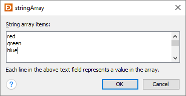
String[] (java.lang)
This custom editor allows you to specify string values for a string array.
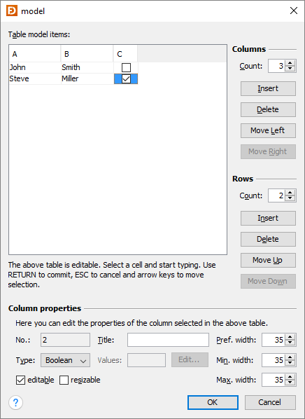
TableModel (javax.swing)
This custom editor allows you to specify values for a table.
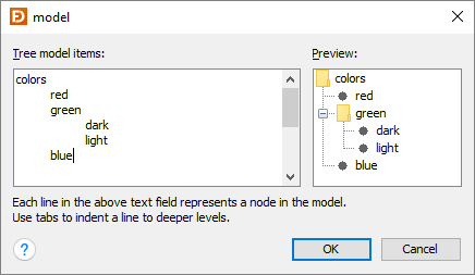
TreeModel (javax.swing)
This custom editor allows you to specify string values for a tree.